


City National of Rochdale
Evolving a Legacy Financial Brand Into a Modern, Scalable Brand System
Industry: Wealth Management / Financial Services
Scope: Brand Identity • Brand Strategy • Art Direction • Brand Governance • Presentation Design • Information Design • Illustration • Marketing Communications • Templates • Print & Digital
A CASE STUDY
CITY NATIONAL OF ROCHDALE
PROBLEM: NO DIRECTION
City National Rochdale (CNR) operated within the larger City National/City National Bank brand ecosystem, creating a unique positioning challenge: how could the organization establish a distinctive, contemporary voice while maintaining the credibility and trust expected of a sophisticated financial-services brand?
The existing visual identity had become dated, dense, and inconsistent across communications. Materials frequently carried too much information, making complex investment content difficult to navigate and diminishing the impact of the underlying messaging.
The opportunity was not simply to “make it prettier.” It was to create a more intelligent visual language—one that could make complex financial information clearer, strengthen brand recognition, and give internal teams a framework they could actually use
The design process is a fluid and subjective cycle.
The spot a project starts in is rarely where it ends up, and the journey is sometimes as important as the destination.
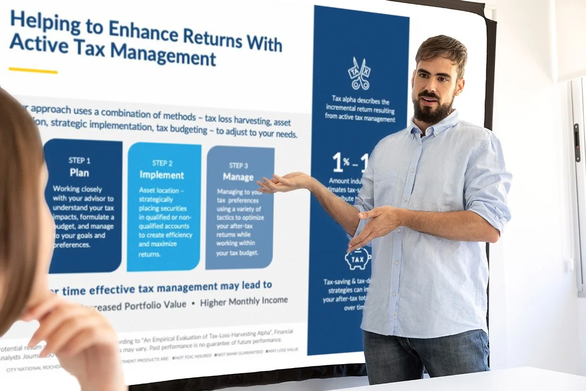
The Process begins with a design brief; a series of questions related to the company as a whole, and discovering the reason the product/brand exists. For CNR, this extended to internal templates, PowerPoint decks, white papers, and more.
THIS PROJECT ALSO INCLUDED
Phrasing & Messaging
Presentation Design
Brand storytelling
Custom illustration, icons and build-out of image library
Internal vs external communications
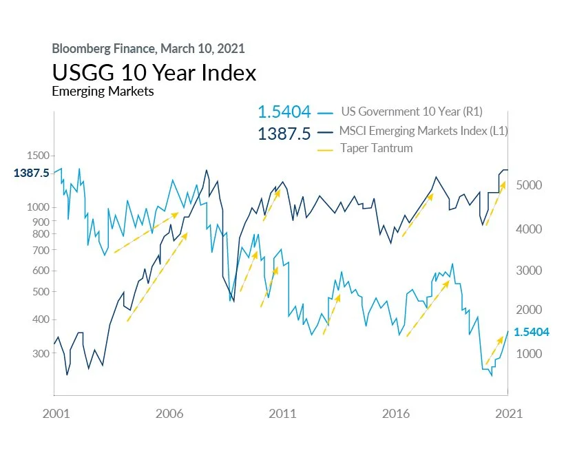
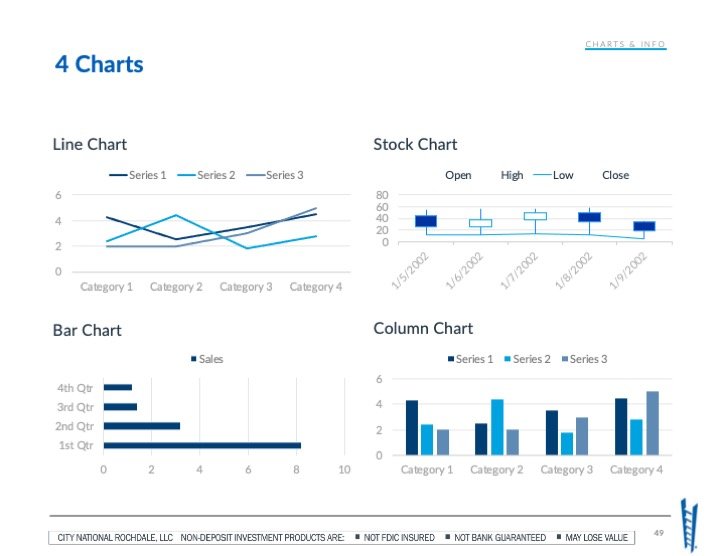
Comprehensive data visualizations
Template customization-education for skill sets and involvement
Expansion of the brand as a whole
THE SOLUTION: A BRIGHT, ENERGETIC, CLEAN, MODERN APPROACH
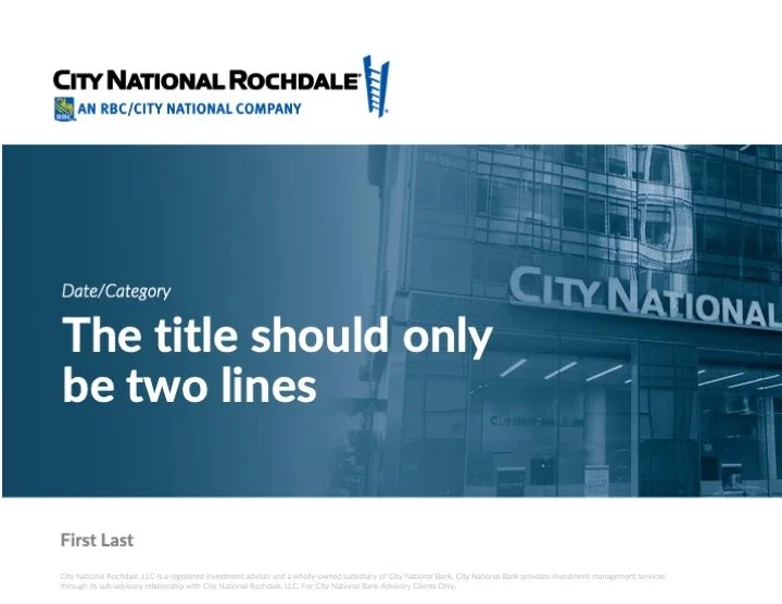
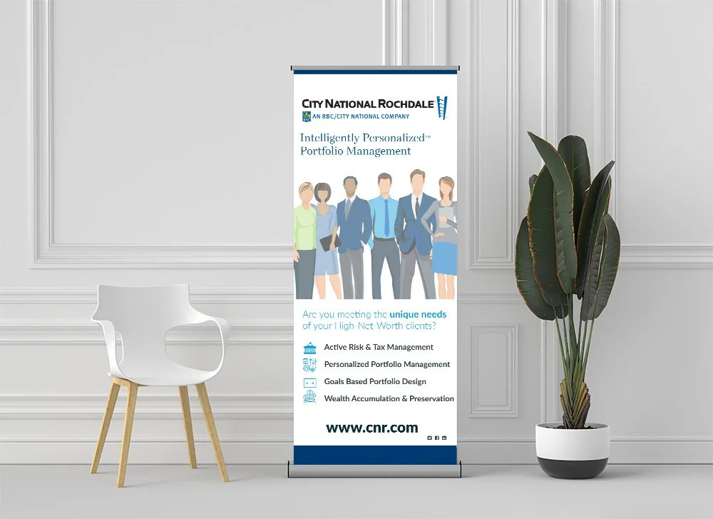
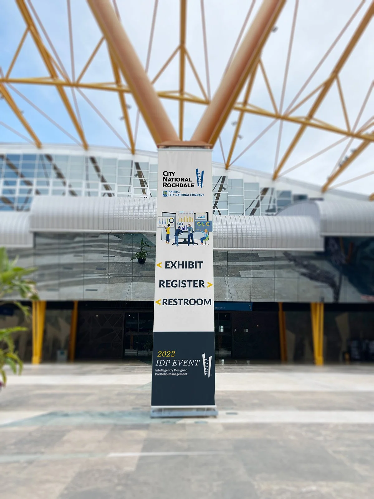
With 'pops' of color, and an updated typographical organization of information hierarchy, the new brand brings a much-needed facelift to the company as a whole. A clean, organized brand identity that can be carried through all materials used by the CNR brand blossomed like a flower and continues to expand outward with events and new opportunities for design solutions.
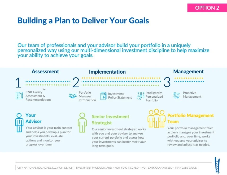
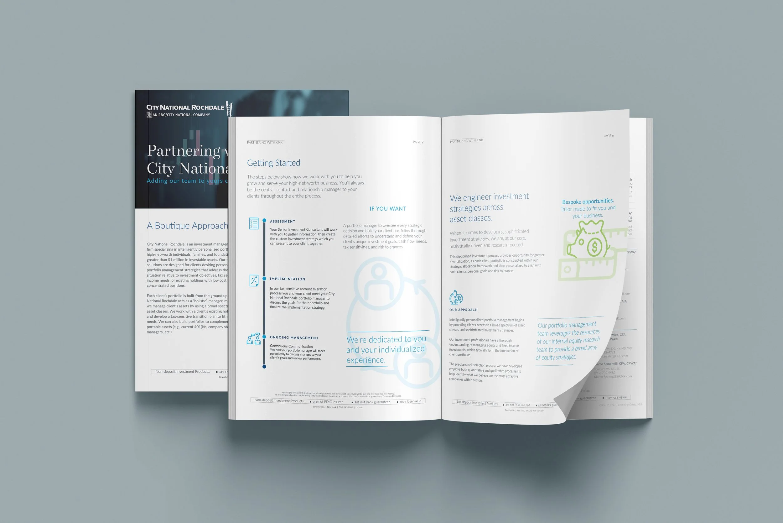
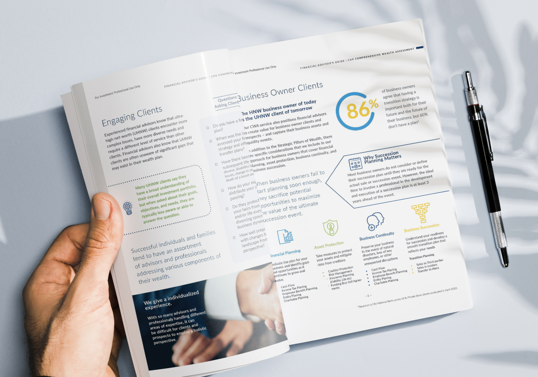
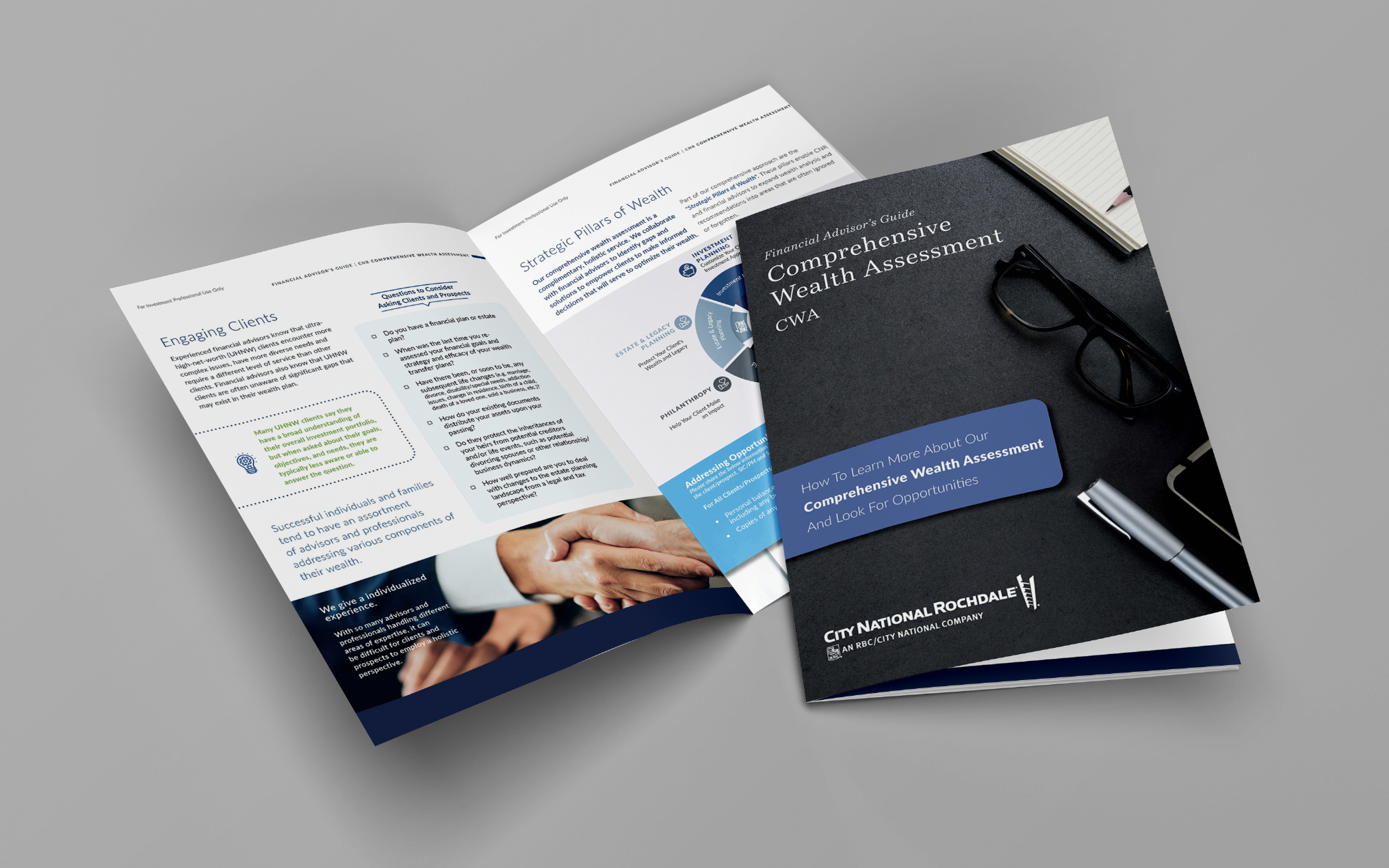
Much of the previously design materials had way too much information in them, making them look heavy and hard to digest. The redesign allows an open fairly feel and gives easily accessible blocks of information to absorb.






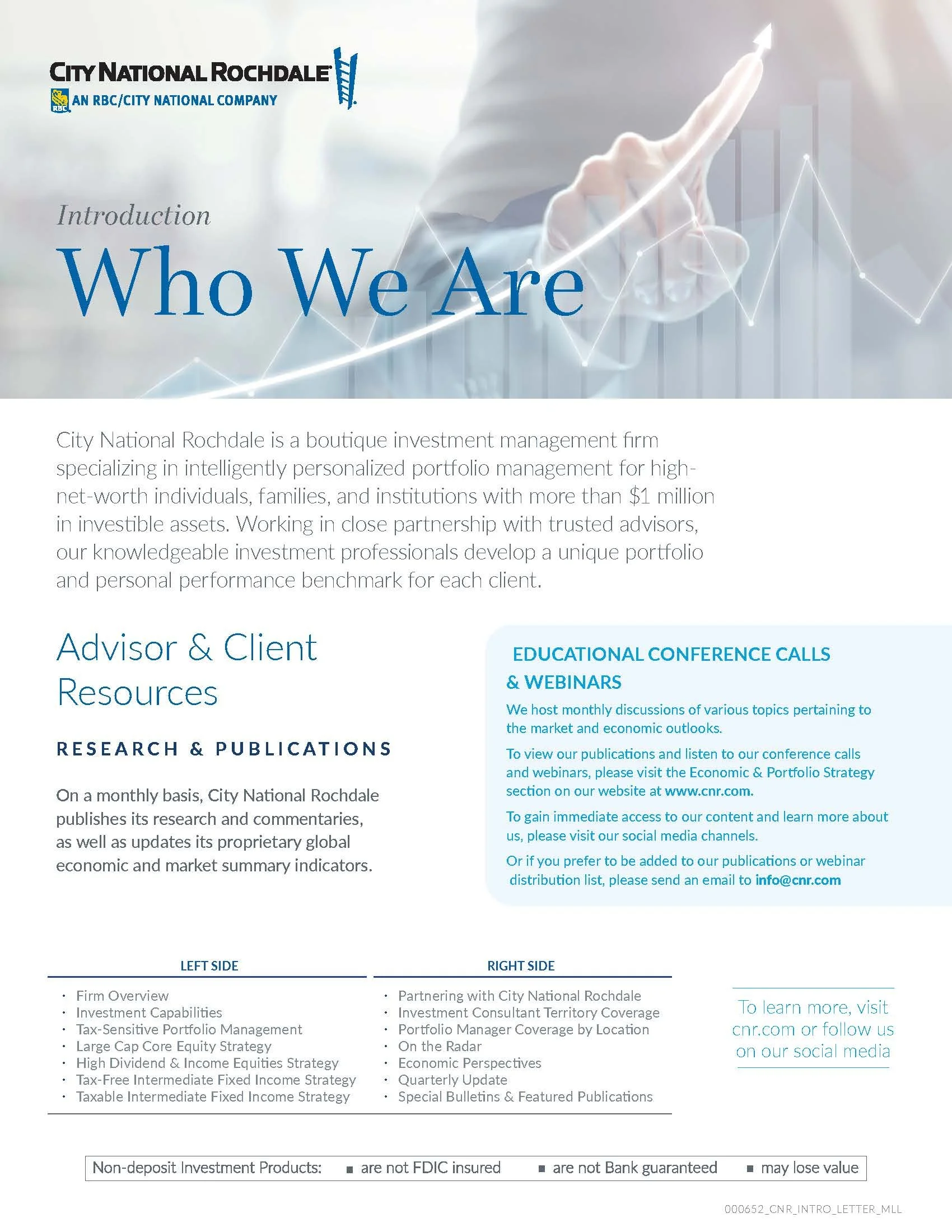


Brand Style Guide
As the project expanded, so too did the need for consistency so the brand identity was key to locking everything in place across all channels.
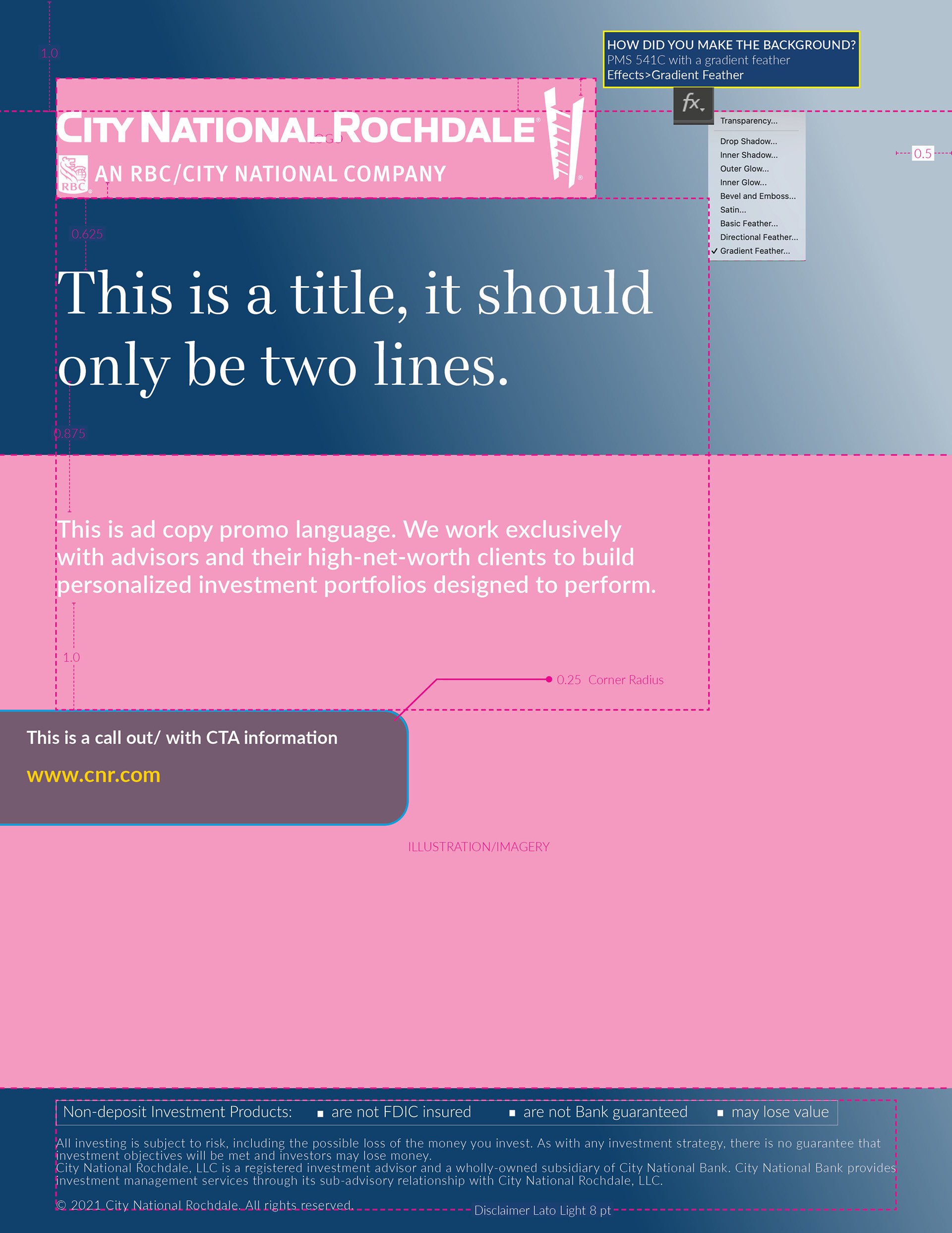
The structure became important, to illustrate how the document was created and why, and all the notations harken back to the brand guidelines so users have a clear line from how the document got built.
With the template build-out, tutorials were offered for the team at CNR so that a confidence level was reached for everyone who needed to pick up these documents.
With any brand identity design, its important to establish rules for the logic behind the new design, and these structure documents helped the team visualize easier.
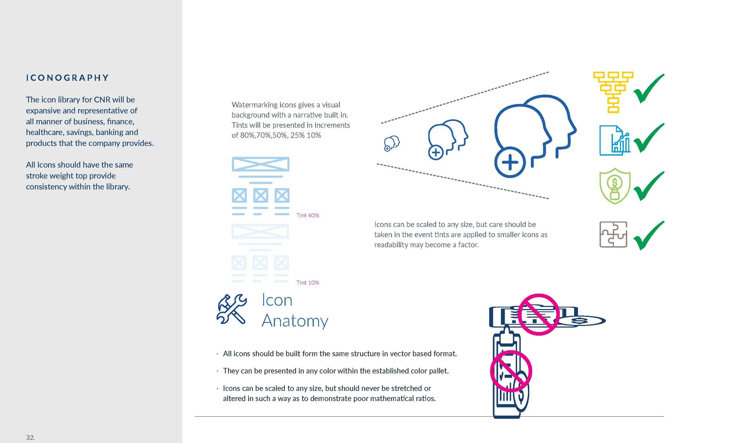
Establishing design rules for everything from chart creation and information data visuals to external documents such as white papers, brochures and promotional materials, the CNR brand guidelines covered it all. It also provides a series of Dos and Dont’s within the brand. This established an easy-to-follow direction for the brand solving for any eventuality that may present itself.
From Brand Refresh to Brand System
The project quickly expanded beyond individual design deliverables.
A critical part of the engagement was establishing the logic behind the design—not just creating finished pieces, but creating a system that explained why those pieces looked and behaved the way they did.
The CNR Brand Style Guide established practical standards for typography, color, layout, charts, data visualization, imagery, illustrations, documents, and marketing communications. It also incorporated clear Do/Don't guidance so the brand could remain consistent as new materials were created.
This transformed the brand from a collection of designed assets into an operational creative system.






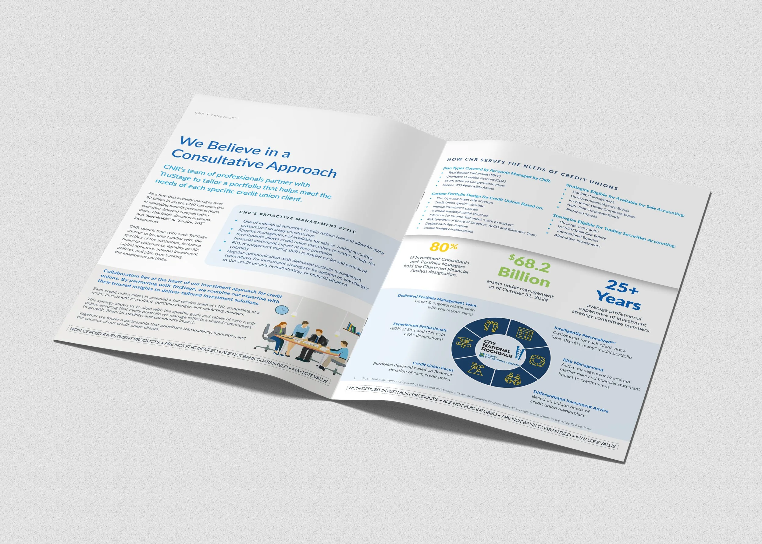
Before & After
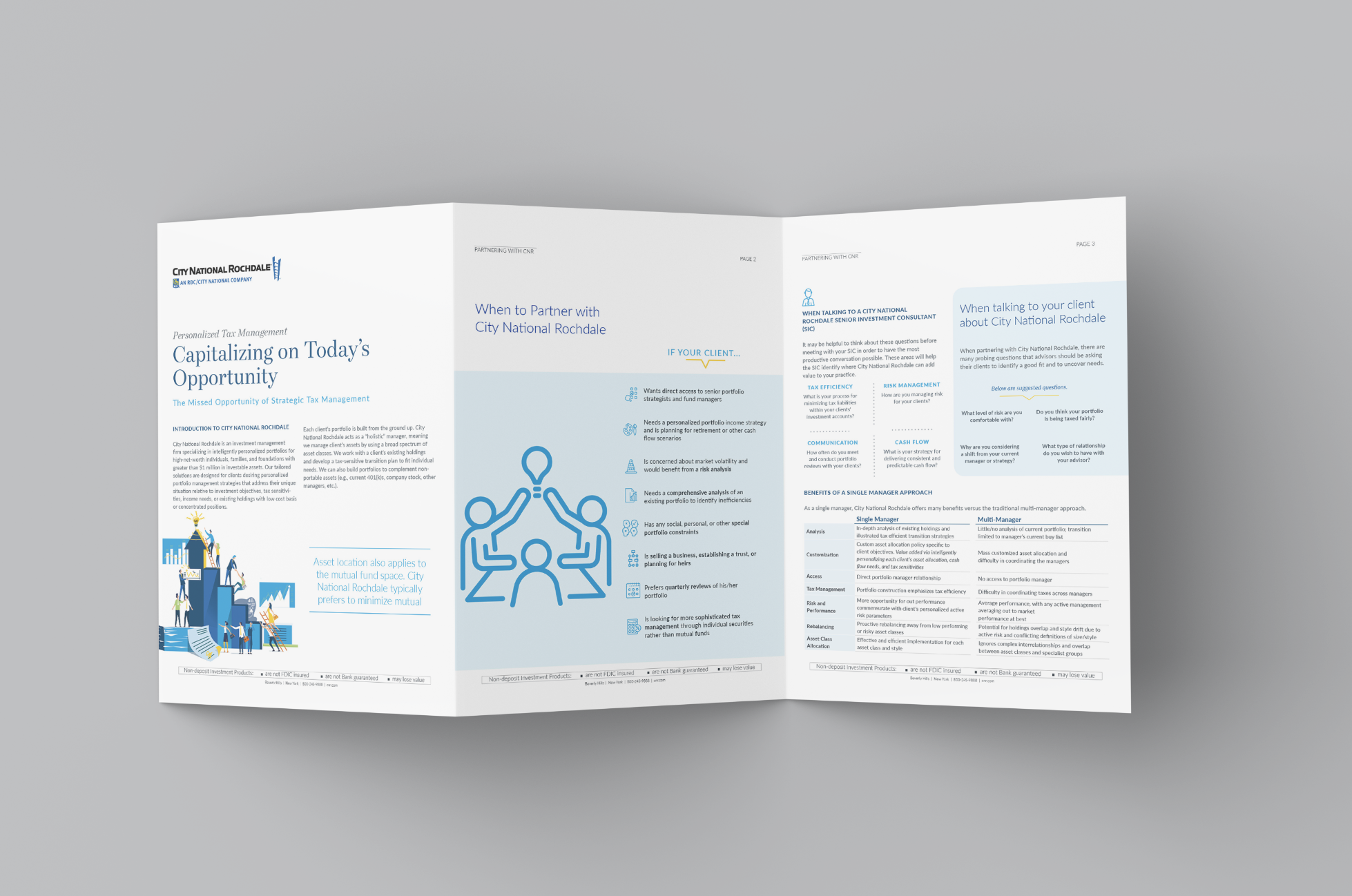
Sometimes, knowing the software isn’t enough. This particular piece wasn’t using its design elements effectively by the previous internal team. It had a table of contents for a 6 page document, and the title was absurdly long. Building a clean layout made all the difference in the final product, and providing a fully editable template to be used in the future made the deliverables approachable and was welcomed.
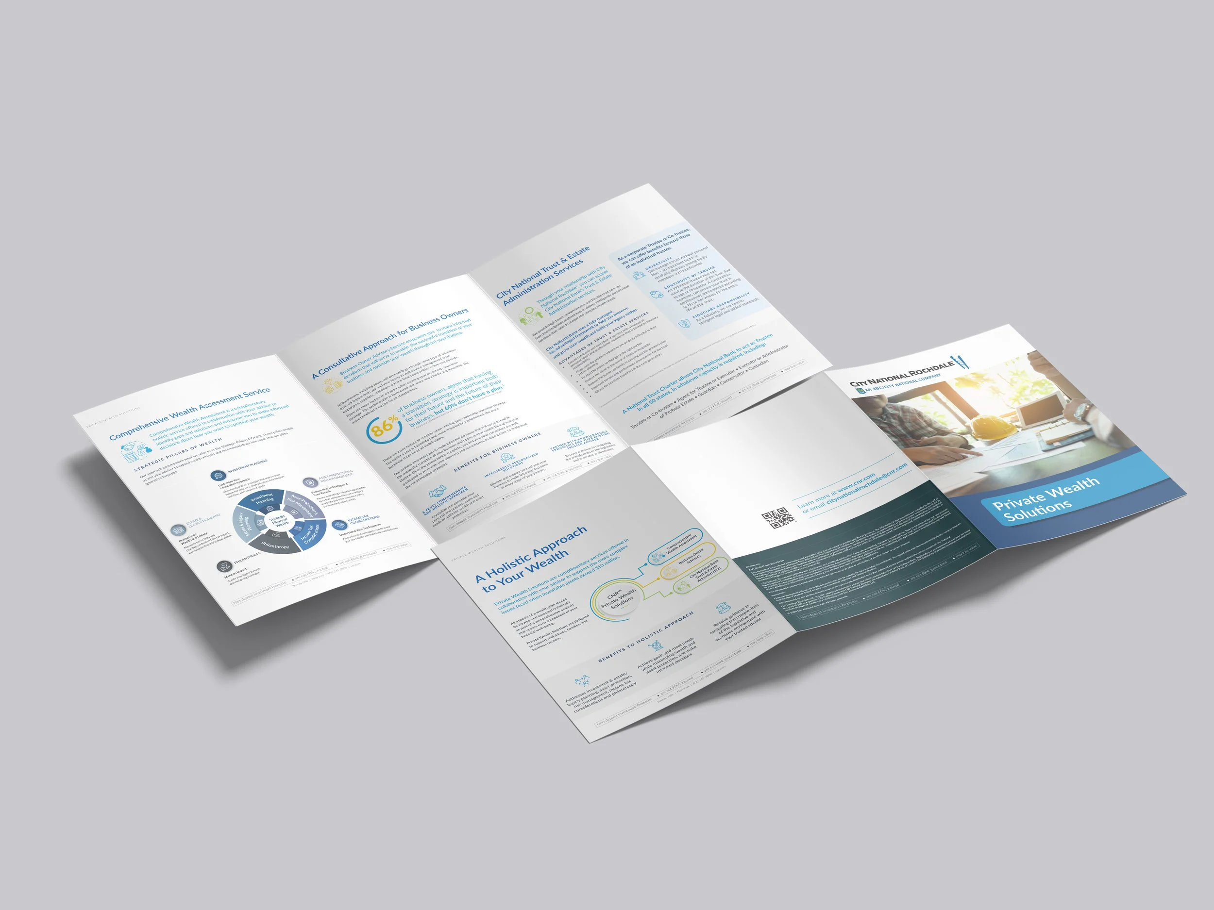
Applying the new brand identity to old documents sometimes became a real challenge. Organizing information on the page was proven successful when given the current treatment of the brand guidelines. Creating custom illustrations enhanced the brand and allowed for an expansion of not only ideas but also an easier way to effectively communicate across all channels.
KEY INSIGHTS
Repositioned brand and investment communications, driving Select Strategies Fund net assets up 47.4% from $154.3M to $227.4M.
Architected a scalable brand identity system encompassing 12 key elements across visual language, digital, and marketing for unified expression.
Translated brand strategy into an intuitive design ecosystem, reducing creative intervention by 98% for non-creative staff.
Orchestrated delivery of brand enablement tools, empowering users to achieve a 95% success rate and driving adoption.
Elevated 125+ client-facing materials, enhancing clarity and consistency in investment narratives and sales collateral.
CNR gained a more contemporary and differentiated visual presence while establishing a repeatable framework for communicating sophisticated investment information.
Modernized the brand
Evolving the visual language from dated and information-heavy to clean, energetic, and contemporary.
Improved information hierarchy
Created clearer pathways through complex financial content.
Strengthened consistency
Established rules that could be applied across channels and document types.
Enabled internal teams
Provided templates, guidelines, and training that allowed teams to work within the system with greater confidence.
Created a scalable creative foundation
The identity could continue expanding into new events, campaigns, communications and business opportunities without reinventing the brand each time.


Let’s Connect.
Virtual via Zoom
Meeting ID: 730 665 8768
Passcode: MLLGD
Call
office (914) 920.9828
text (914) 325.1619
Email
info@mllgd.com