

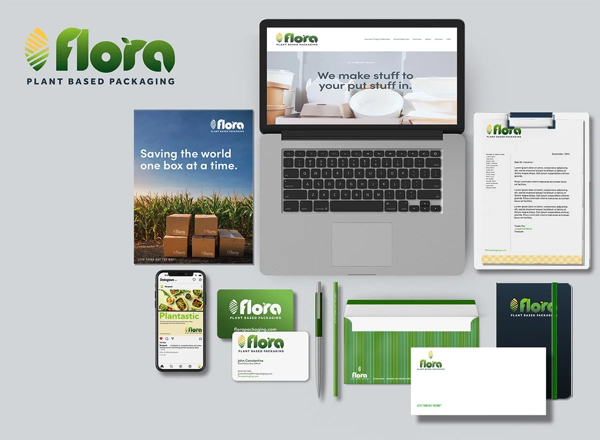
Flora Packaging
Turning Product Innovation into a Distinctive Packaging System
THE CHALLENGE
Flora required a packaging identity capable of communicating product innovation, natural ingredients, and brand differentiation in a visually competitive marketplace.
The challenge was to move beyond conventional "natural" packaging cues and create a system that could make the product immediately recognizable while giving the brand a distinctive visual point of view.
The packaging needed to balance consumer appeal, product communication, shelf presence, and brand consistency—while creating a foundation that could extend across future product applications.
The Strategic Approach
The creative direction began with the product itself.
Flora's corn-based composition provided an authentic story and a natural source of differentiation. Rather than treating the ingredient as secondary information, the design strategy elevated it into a central visual and storytelling element.
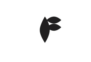



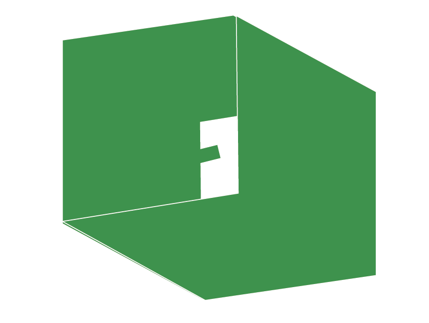

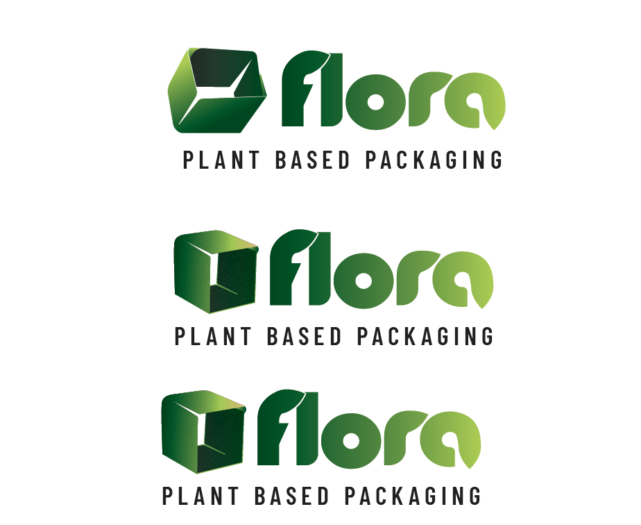
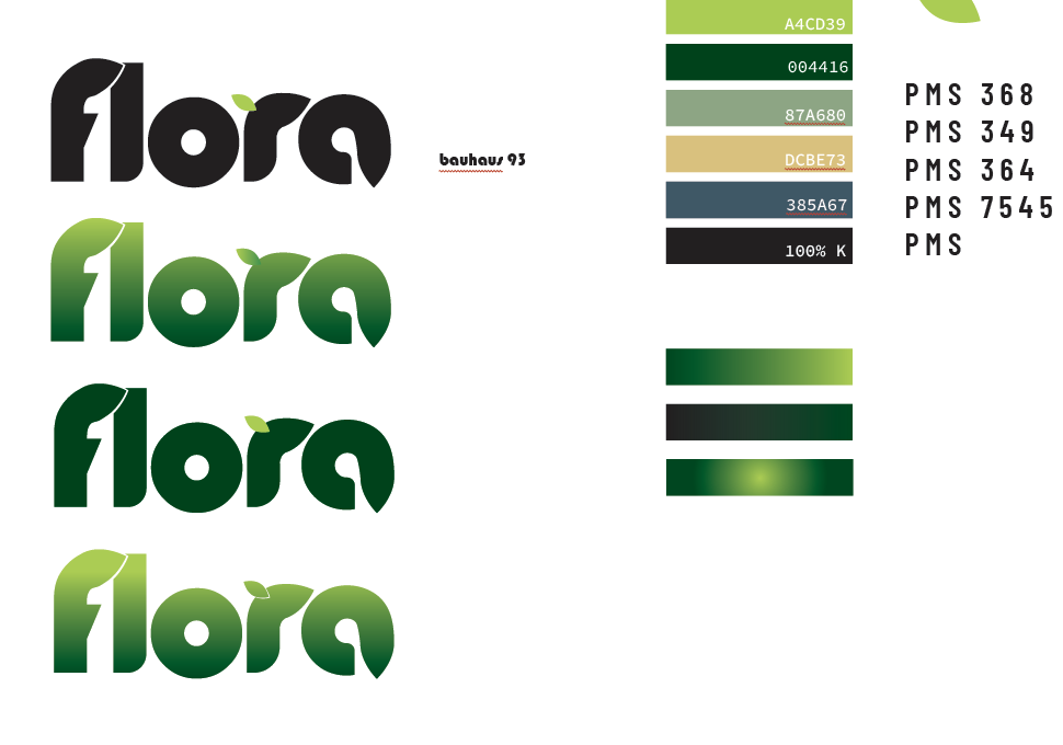
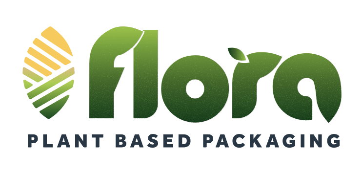
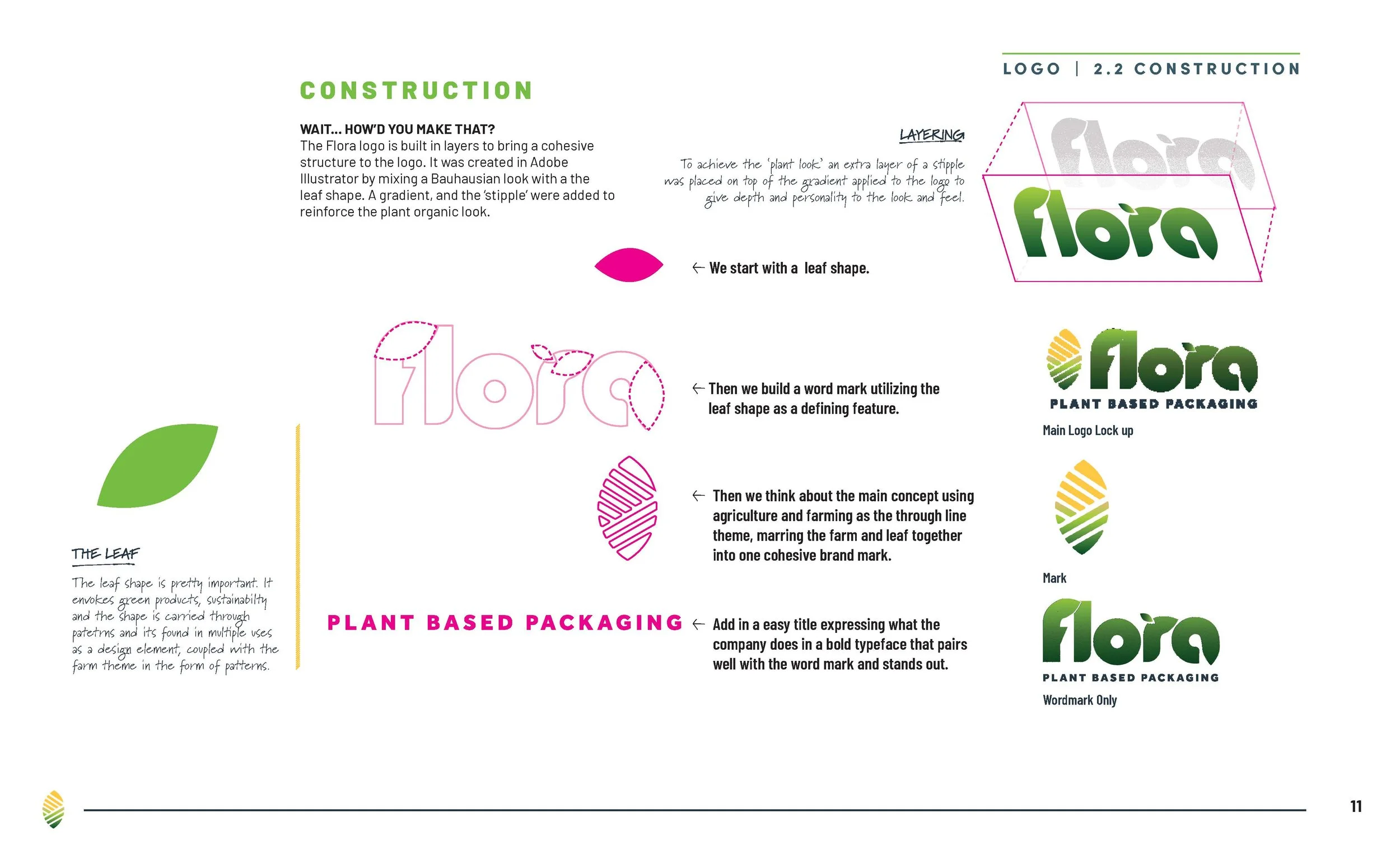
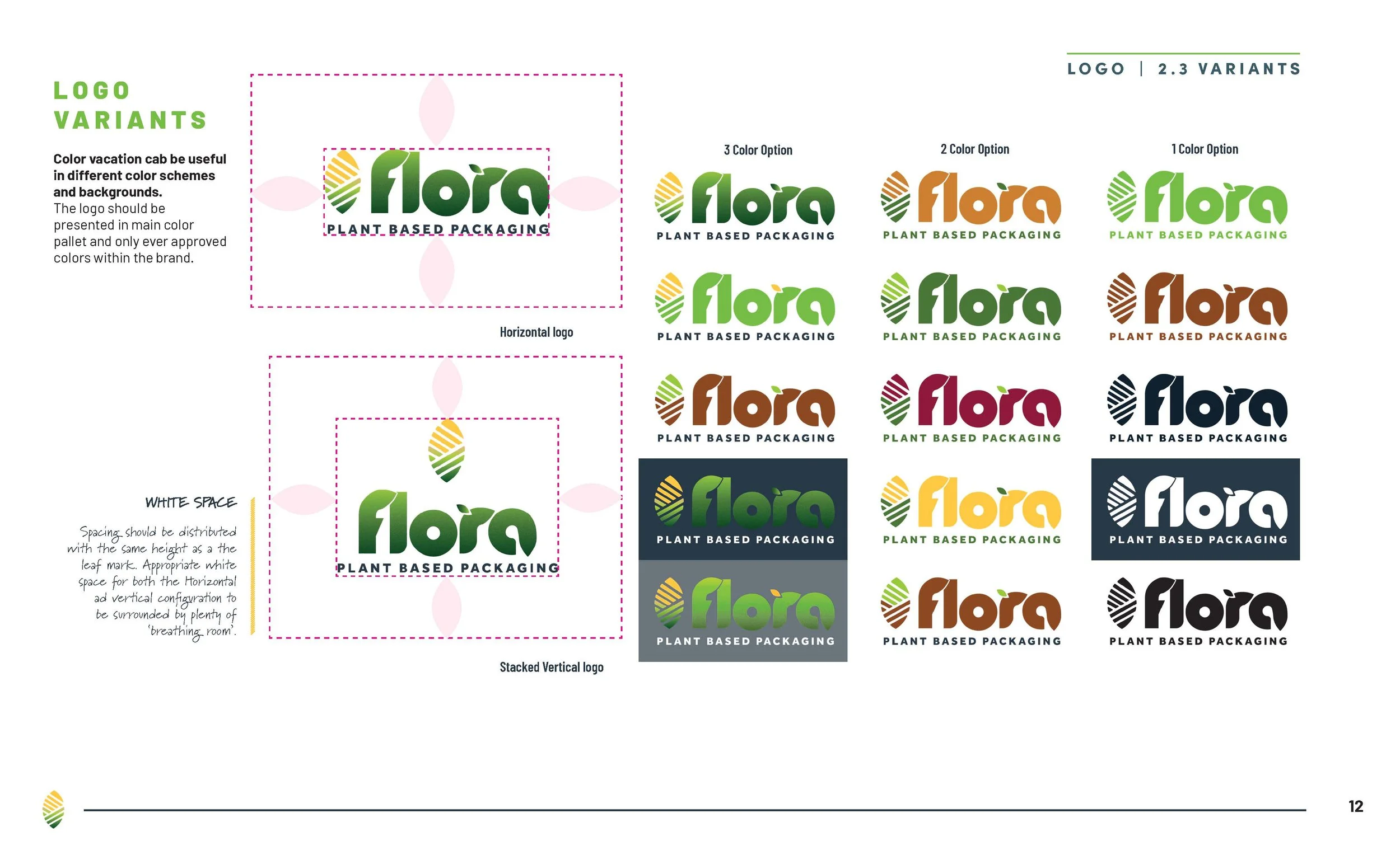
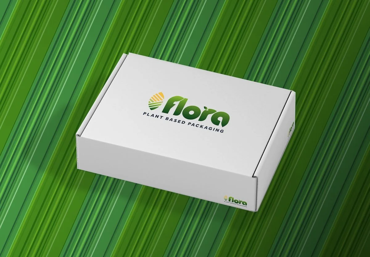
The logo went through a lot of ideation, sketches and eventually evolved into a clean yet robust logo able to be presented on any platform, with three, two and one color options for use.
Flora was conceived around the intersection of agriculture, sustainability, packaging, and innovation.
The project explored a fundamental contradiction in the American agricultural system: corn is produced at enormous scale, yet much of its value is concentrated in food and highly processed products.
Flora proposed another path—using corn starch as the raw material for sustainable packaging.
The concept positioned the agricultural resource as a potential solution for multiple interconnected challenges, including plastic waste, dependence on petroleum-based materials, agricultural sustainability, and the need for more environmentally responsible products.
From Leaf Box to Corn + Leaf
The visual identity evolved through an iterative process of sketches, concepts, and visual experimentation.
The initial idea was to create a box constructed entirely from a plant or leaf, creating an immediate visual connection between packaging and sustainability. After multiple iterations, the box concept was ultimately abandoned because it did not translate into the distinctive mark envisioned for the brand.
The breakthrough came from shifting the focus from what the packaging looked like to what the packaging was made from.
That led to the final corn-and-leaf mark.
The identity combines:
A corn motif representing the material foundation
A leaf representing nature and sustainability
A subtle stipple texture adding visual depth
A touch of yellow reinforcing the corn concept
Gradient elements creating a transition into the Flora wordmark
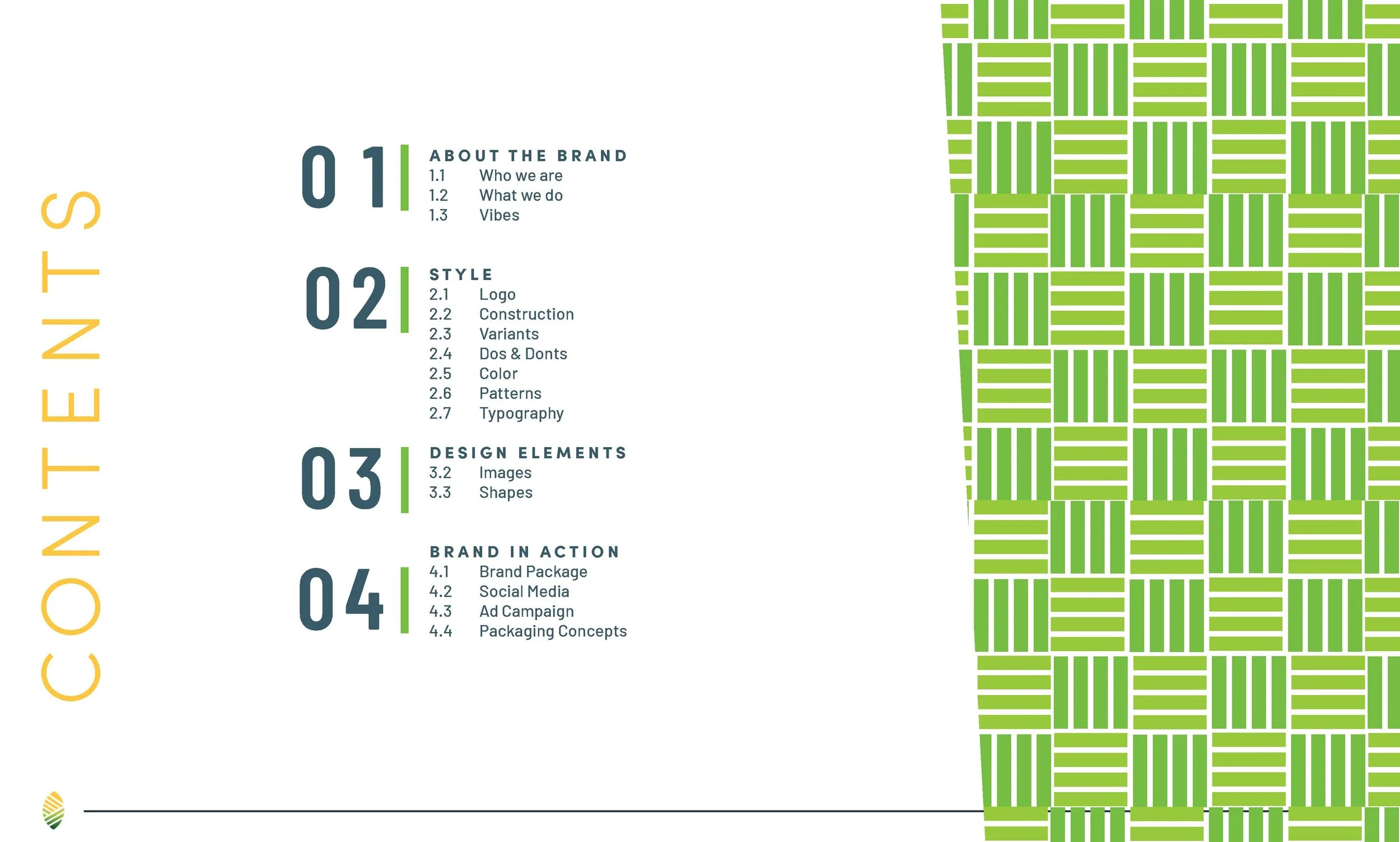
Brand Style Guide
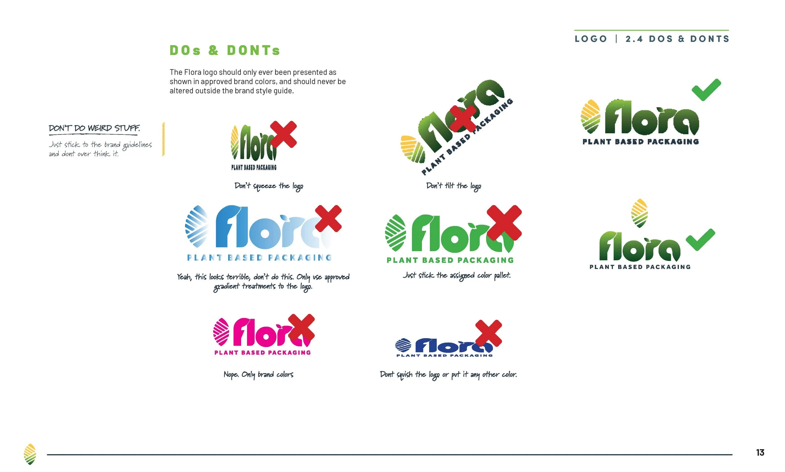
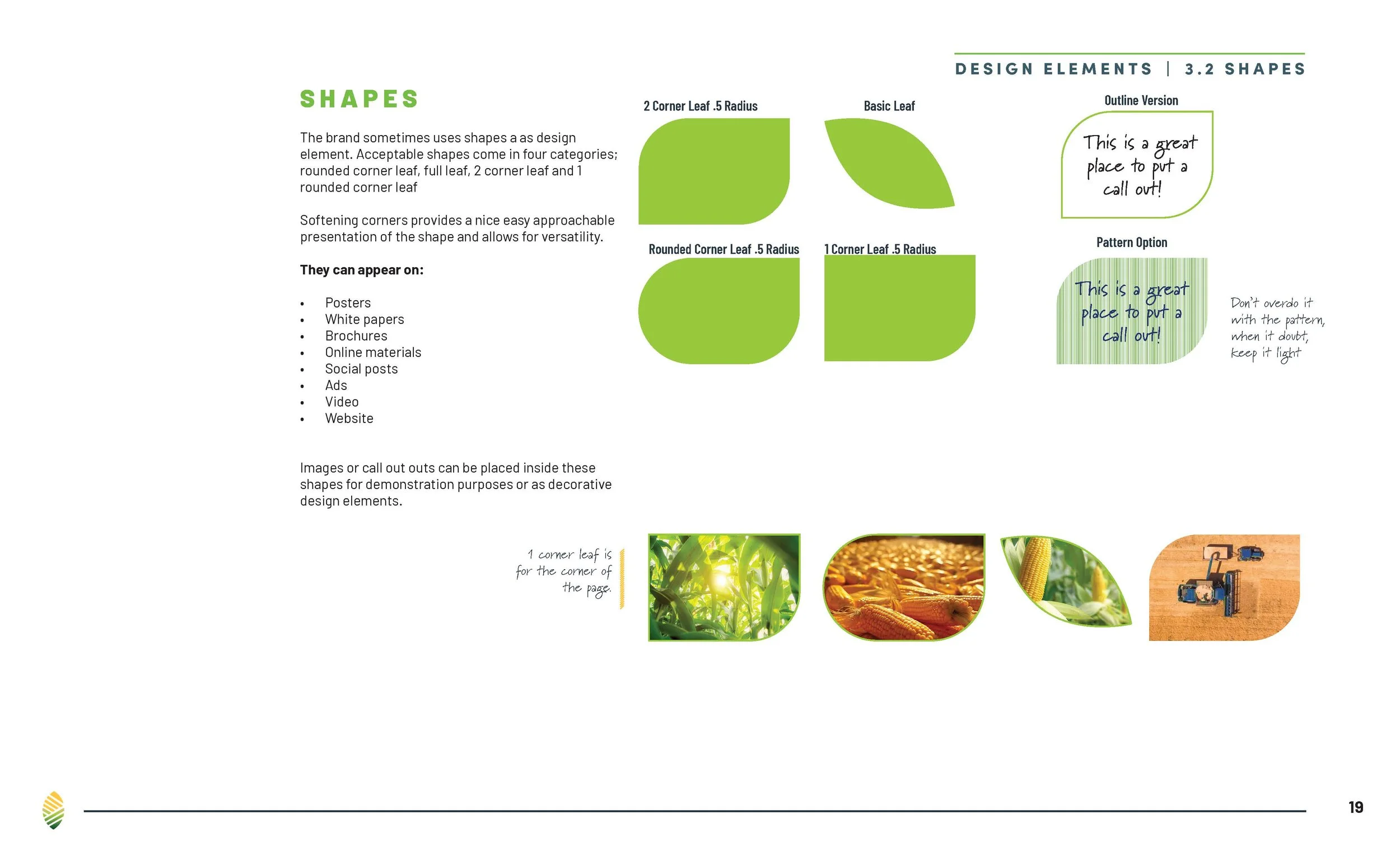
As the project expanded, so too did the need for consistency so the brand identity was key to locking everything in place across all channels.
The structure became important, to illustrate how the document was created and why, and all the notations harken back to the brand guidelines so users have a clear line from how the document got built.
Creative Direction
The visual system was developed around a clean, contemporary aesthetic designed to make the product story accessible and memorable.
Key creative decisions focused on:
Establishing a clear brand-to-product hierarchy
Translating the corn-based ingredient into a distinctive visual language
Creating strong front-of-package communication
Balancing natural product cues with a modern, commercially relevant aesthetic
Developing a flexible system that could accommodate additional products and variations
Maintaining visual consistency across packaging applications
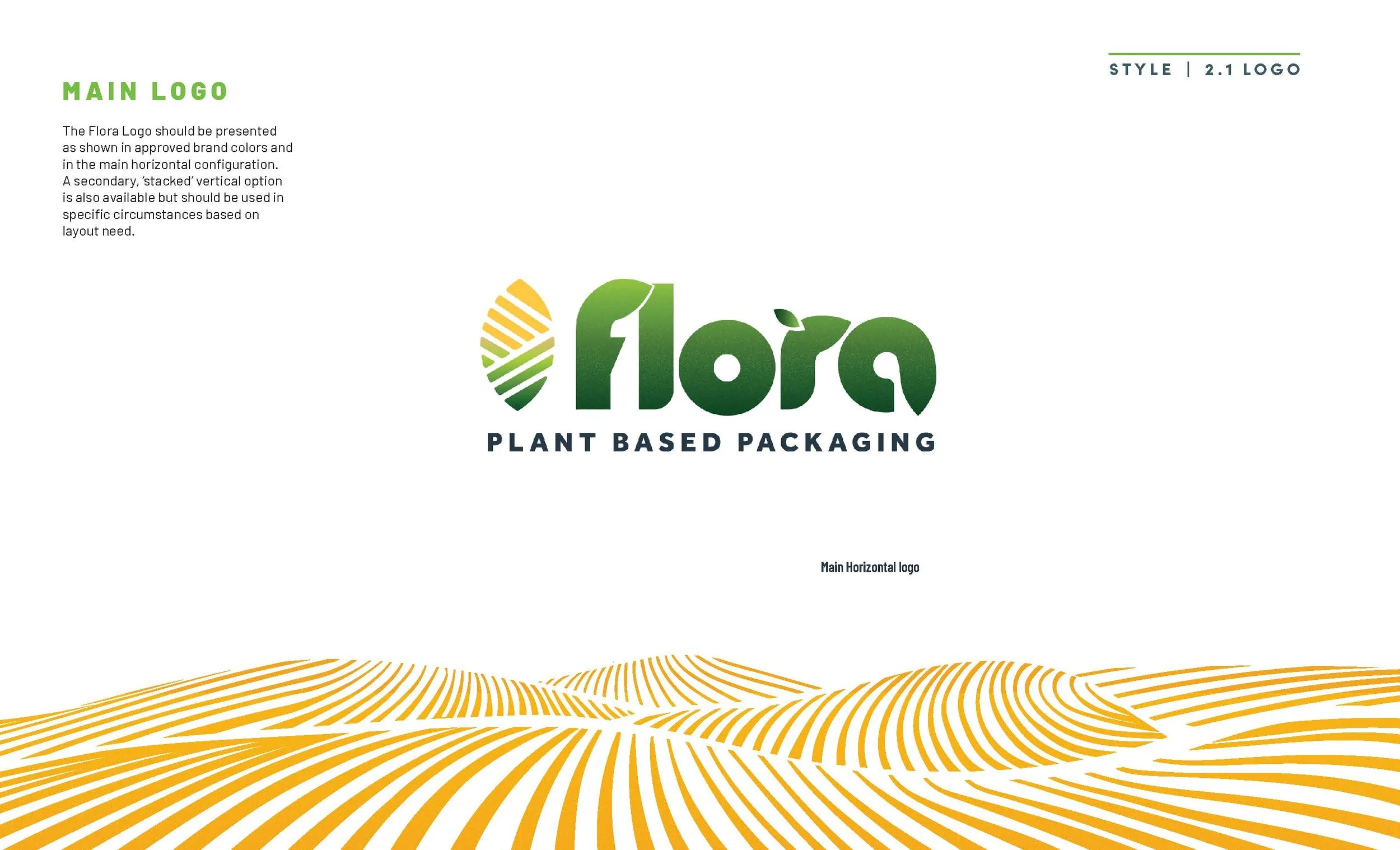
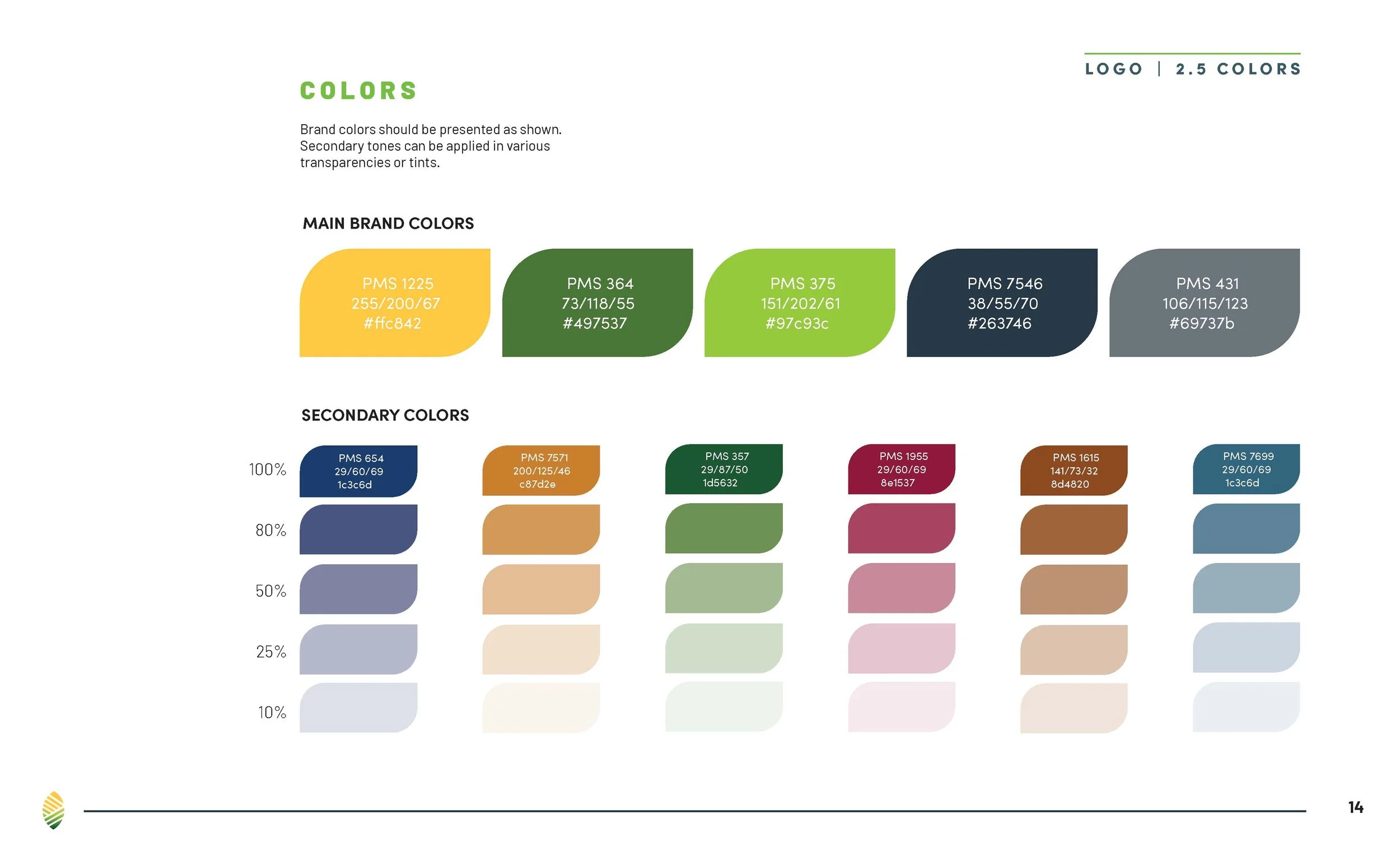
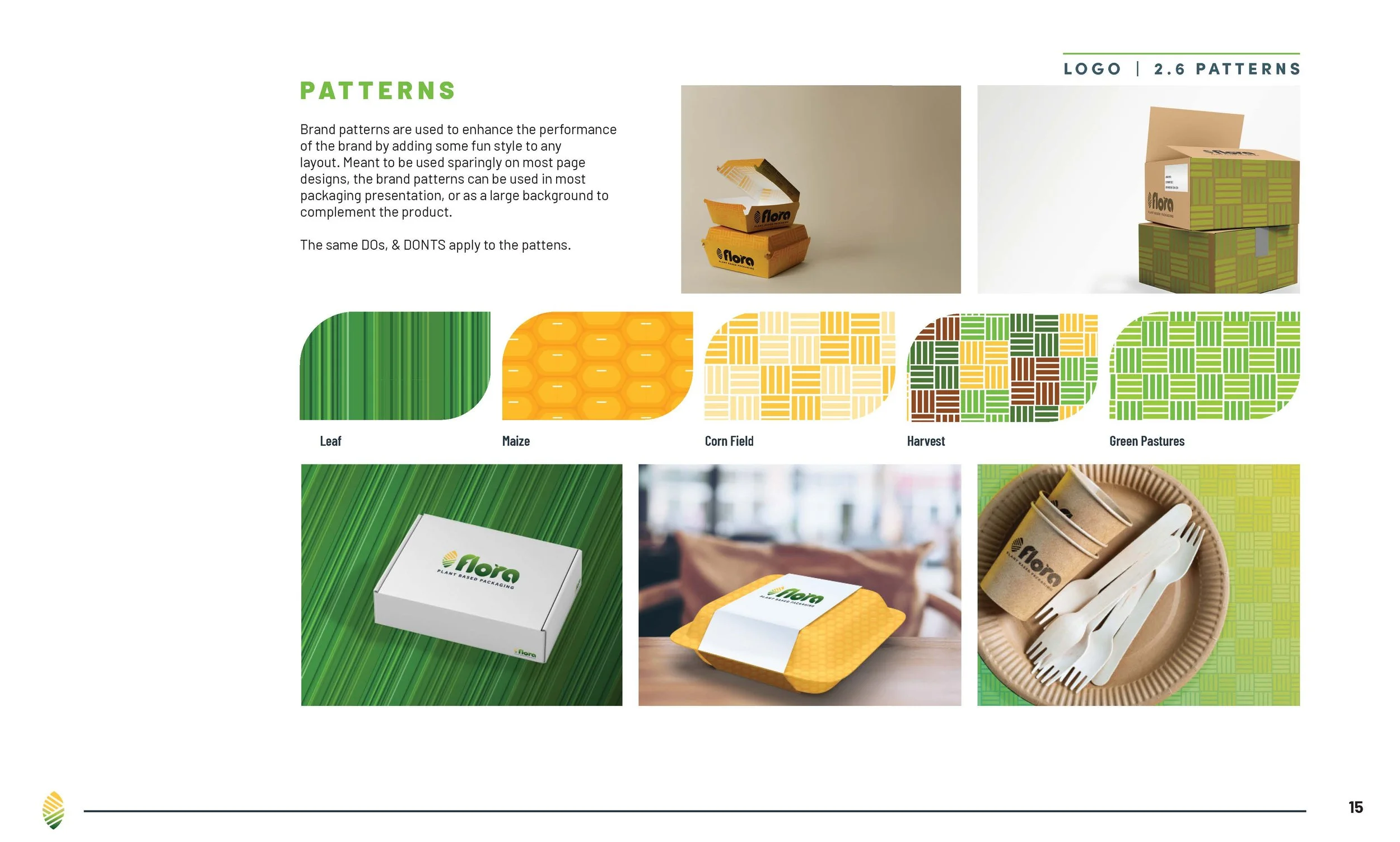
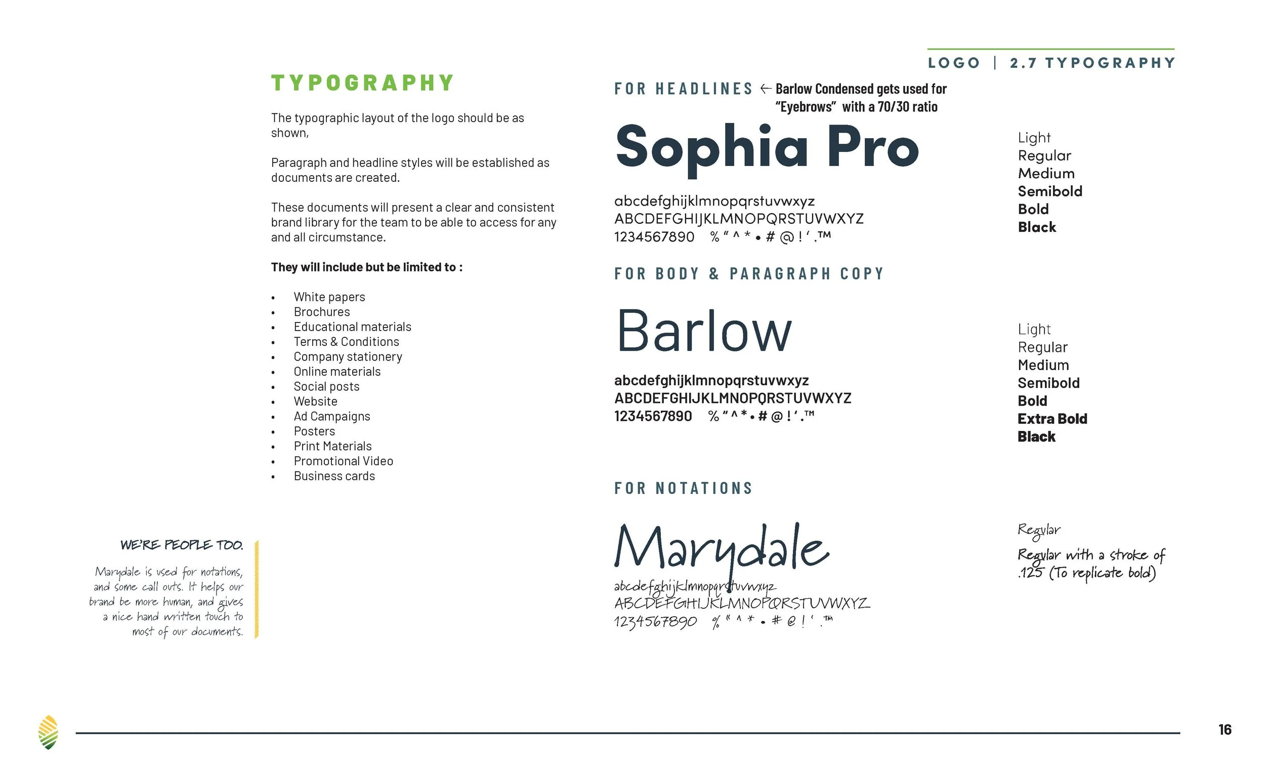
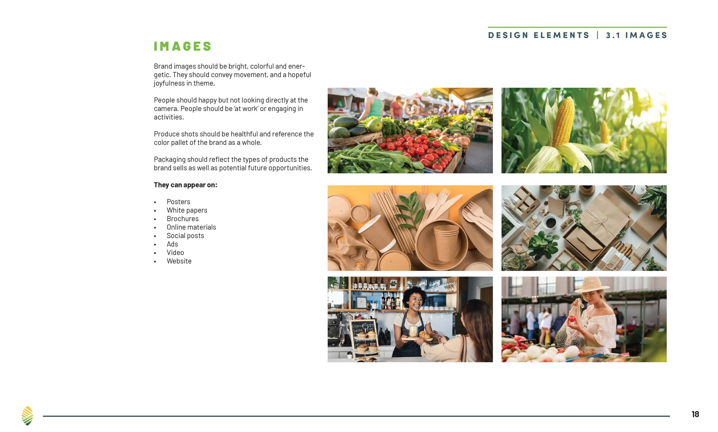
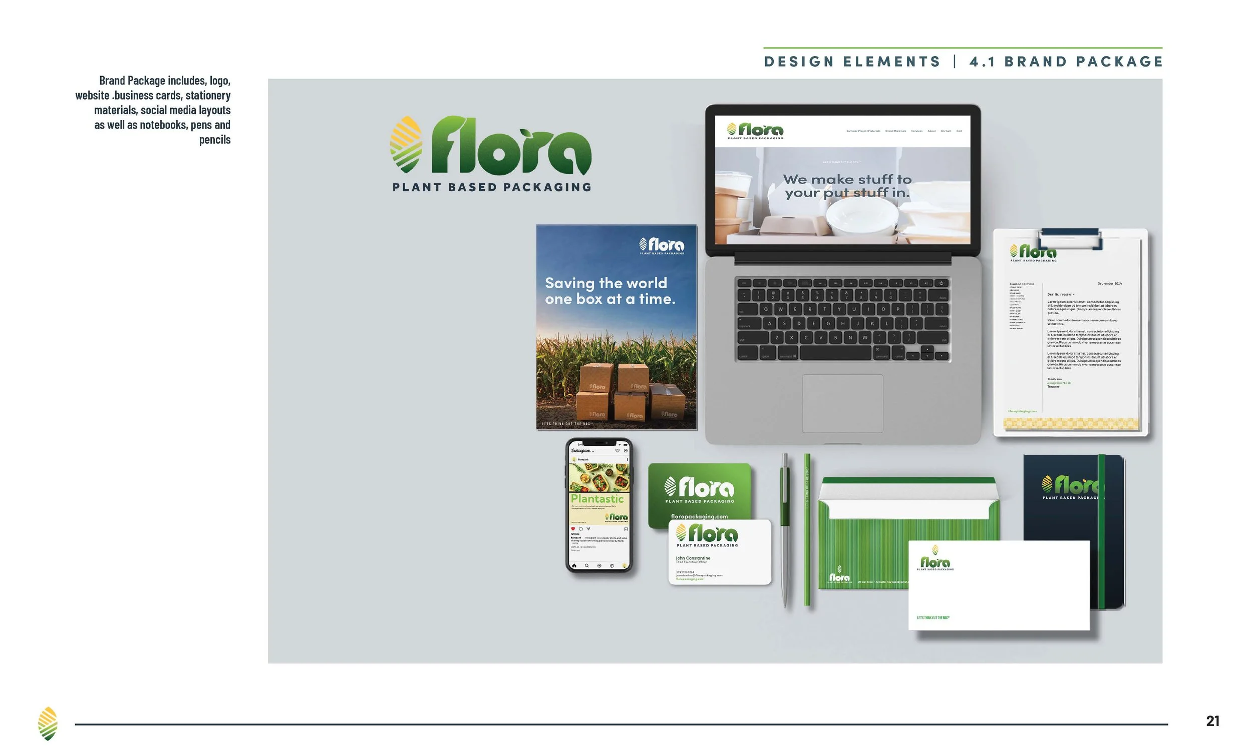
The Flora identity was intentionally designed with expansion in mind. Rather than creating a logo for one packaging product, the strategy considered how the brand could evolve as new applications emerged.
The project specifically explored whether corn starch could support applications beyond packaging—including shipping materials, ice packs, building materials, disposable products, and other future markets.
That required a brand identity capable of functioning across multiple platforms. Multiple logo variants were therefore developed for print and digital applications, creating a flexible identity system that could accommodate different future use cases.
Packaging Design
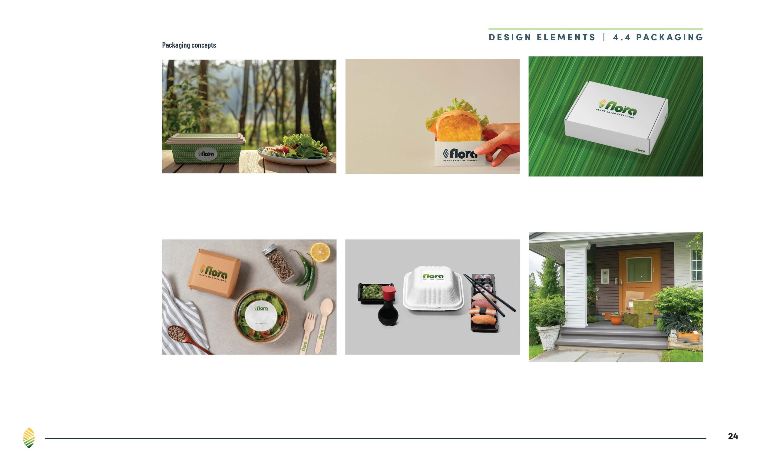
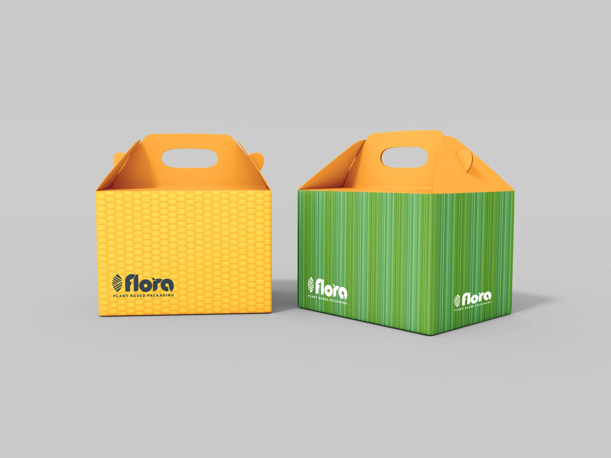
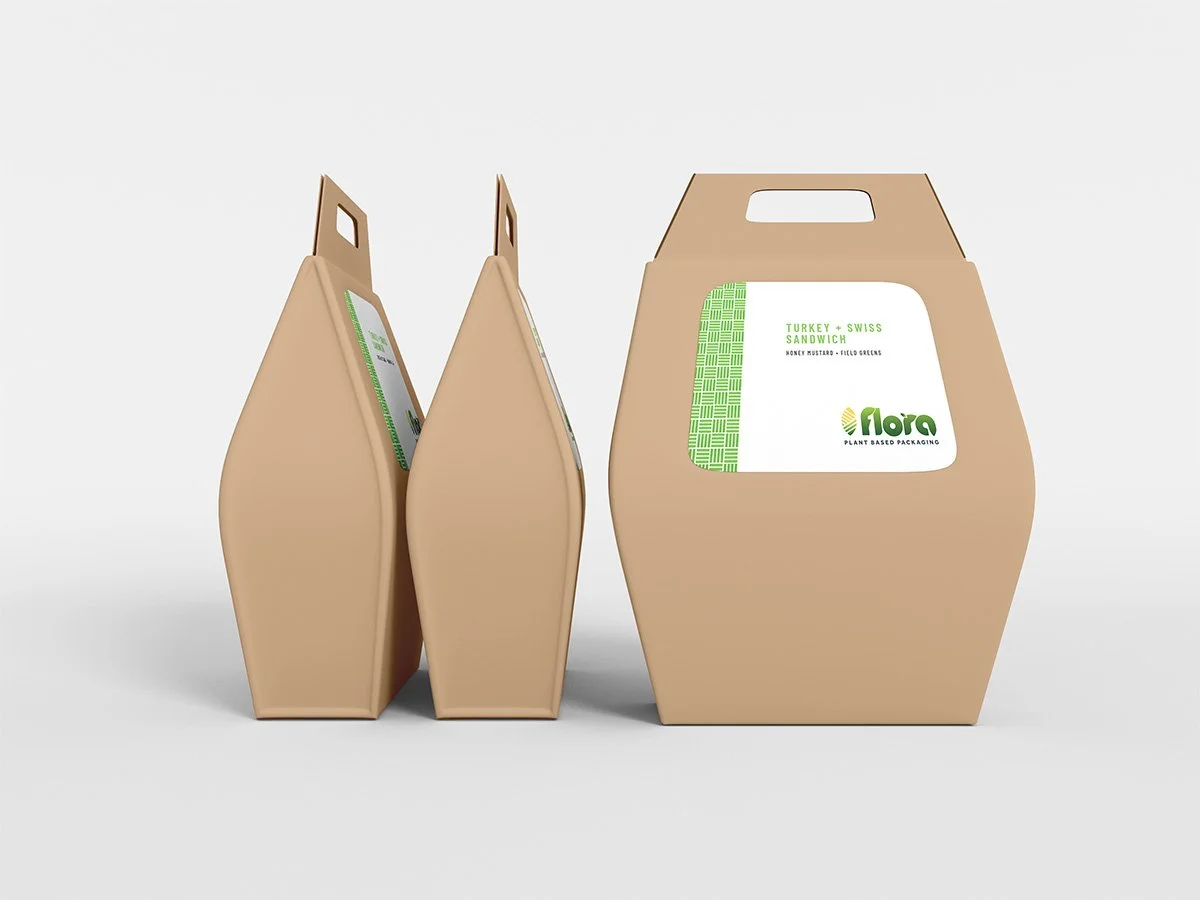
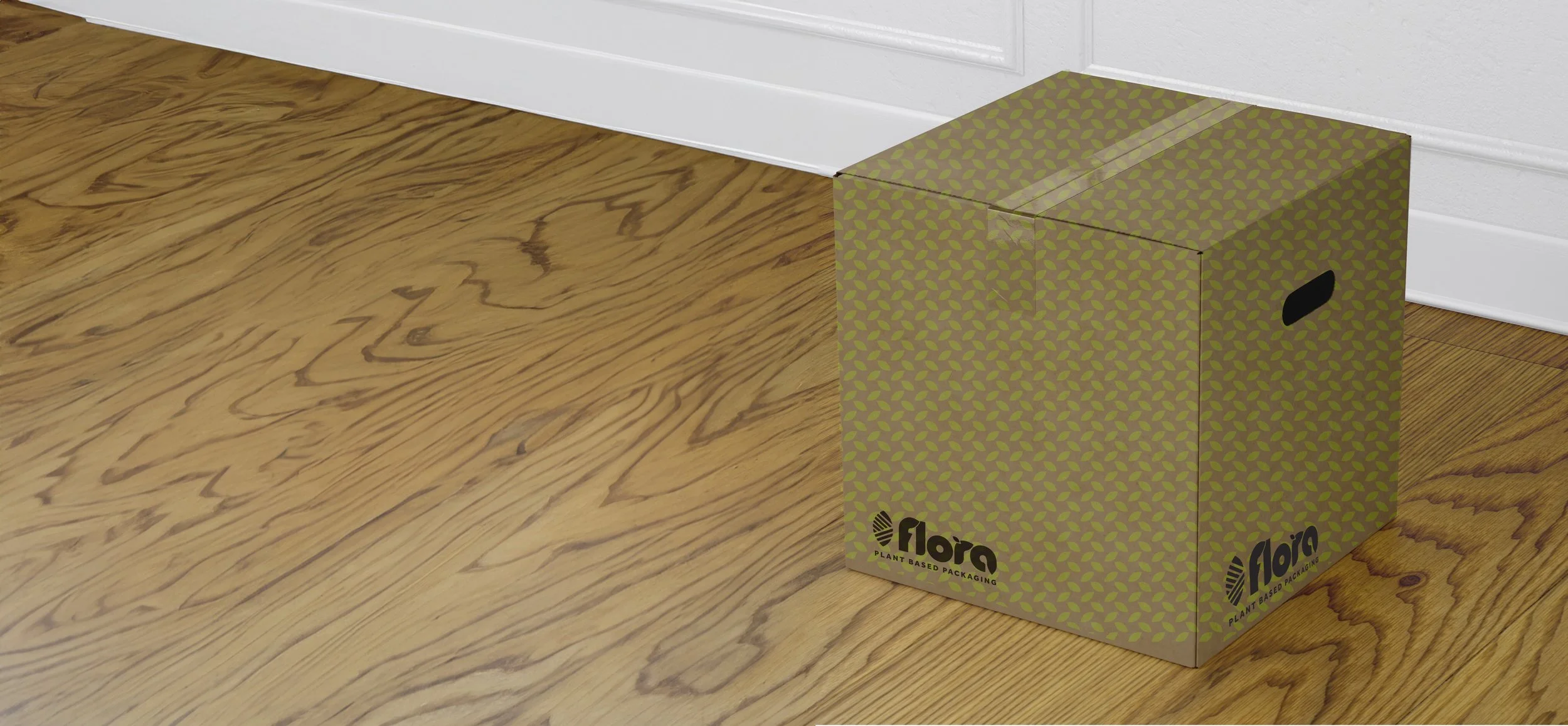
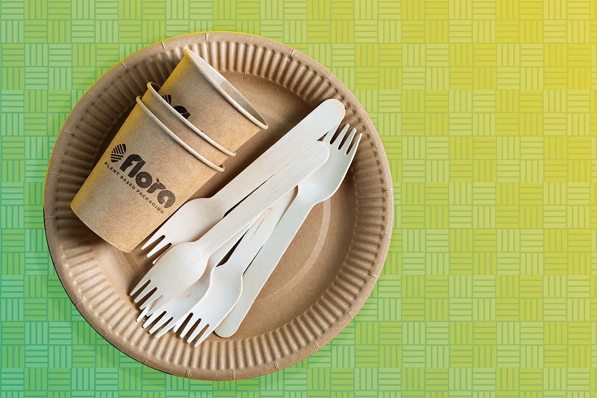
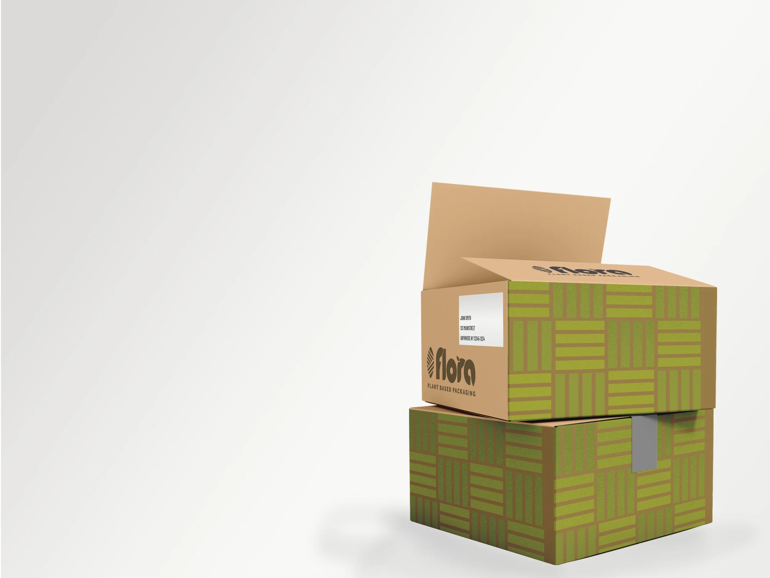
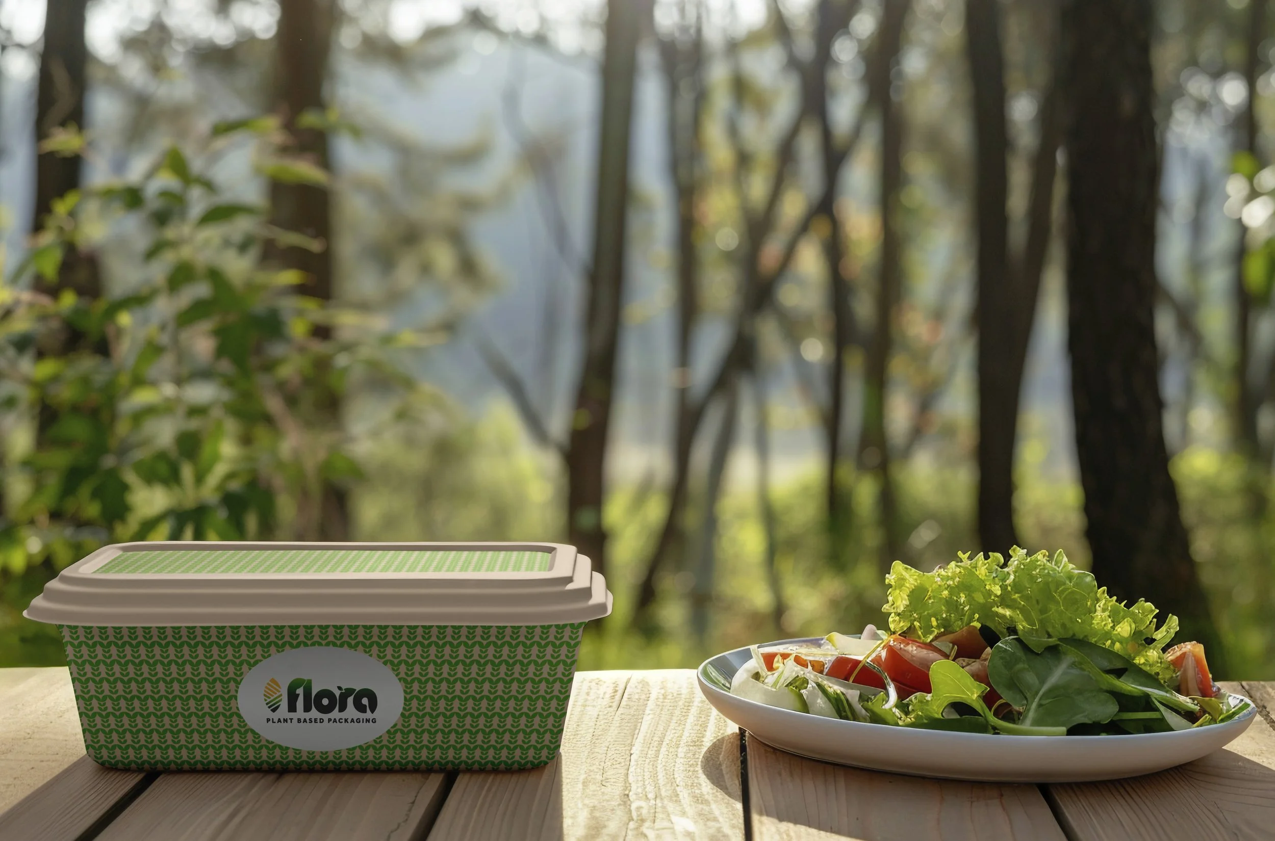
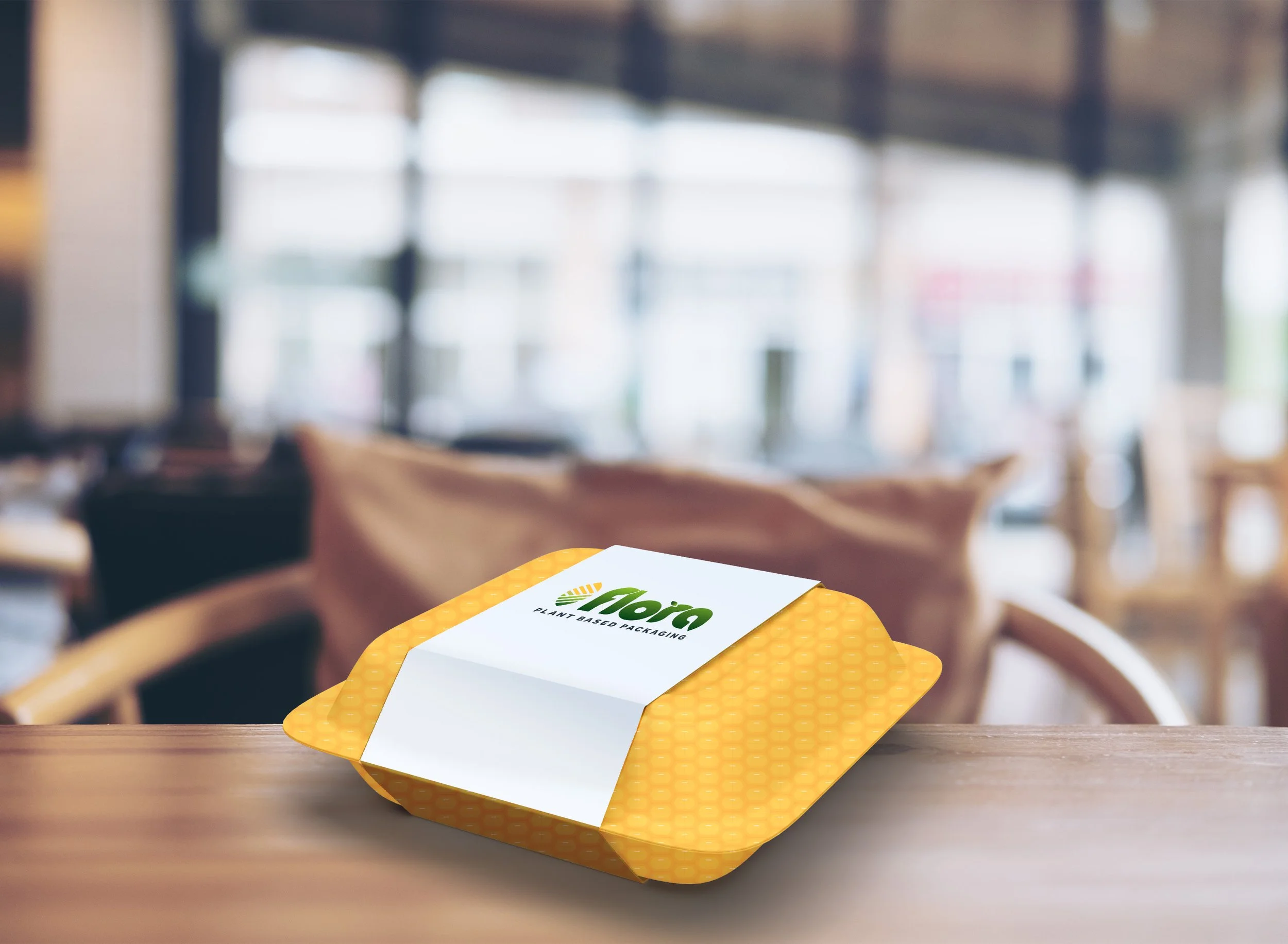
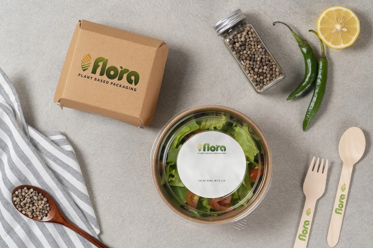
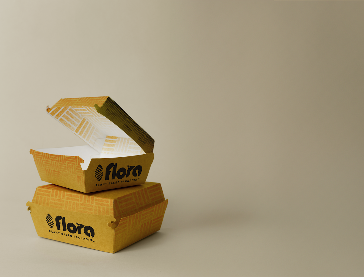
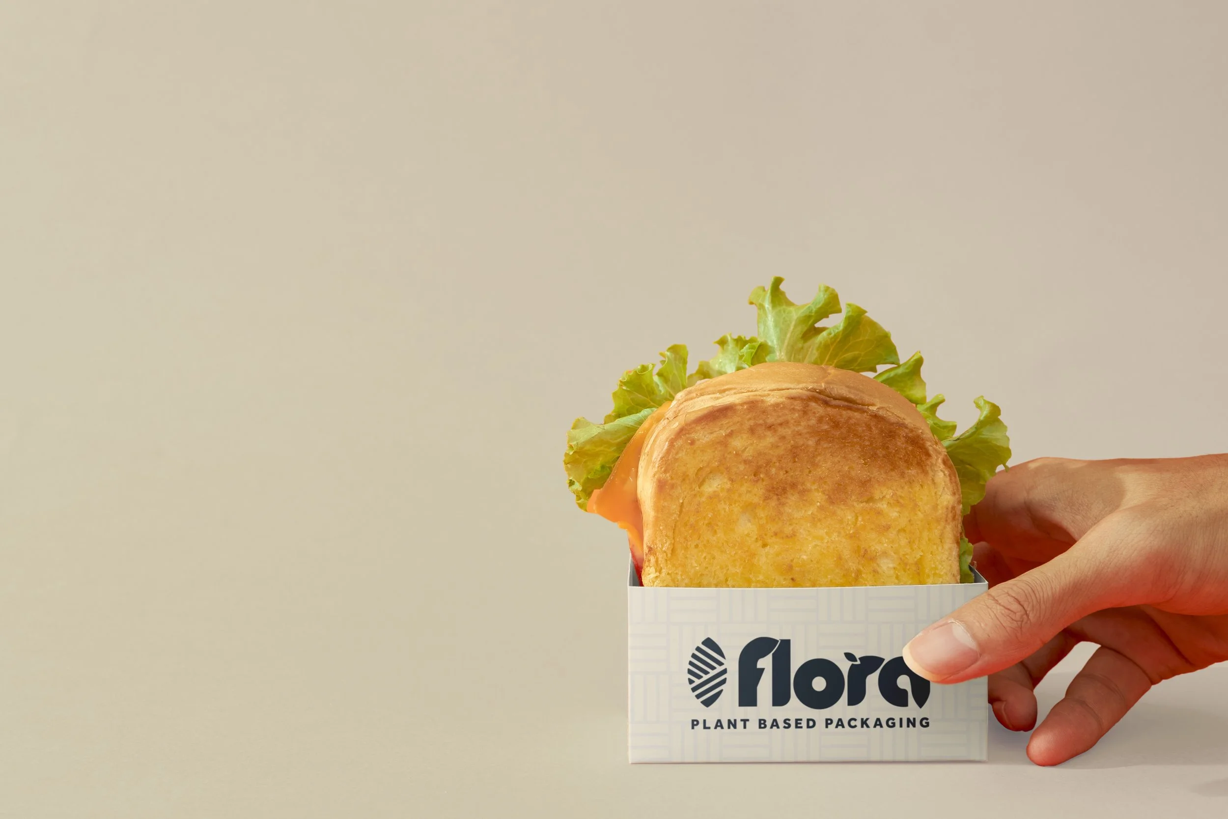
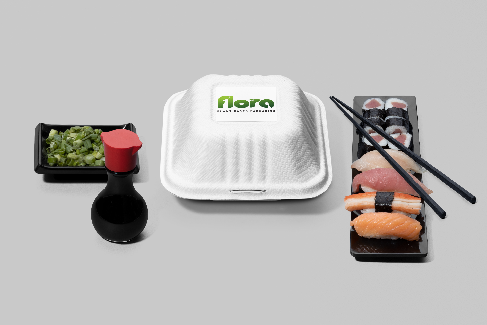
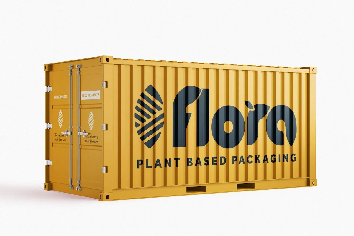
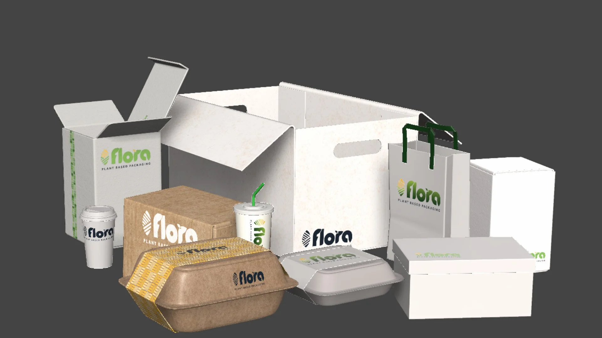
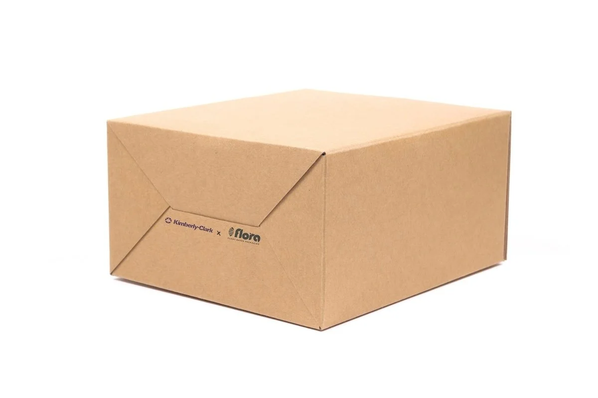
The packaging architecture was designed to create a cohesive brand experience while allowing individual products to retain their own identity.
Typography, imagery, graphic elements, information hierarchy, and color relationships were considered as components of one larger system.
This approach created a packaging framework that could function across multiple touchpoints while maintaining recognizable Flora brand equity.
White labeling options were also explored so that a third party could adopt the Flora Packaging technology and apply it to their products, furthering the goal of equity and sustainability within the business itself.
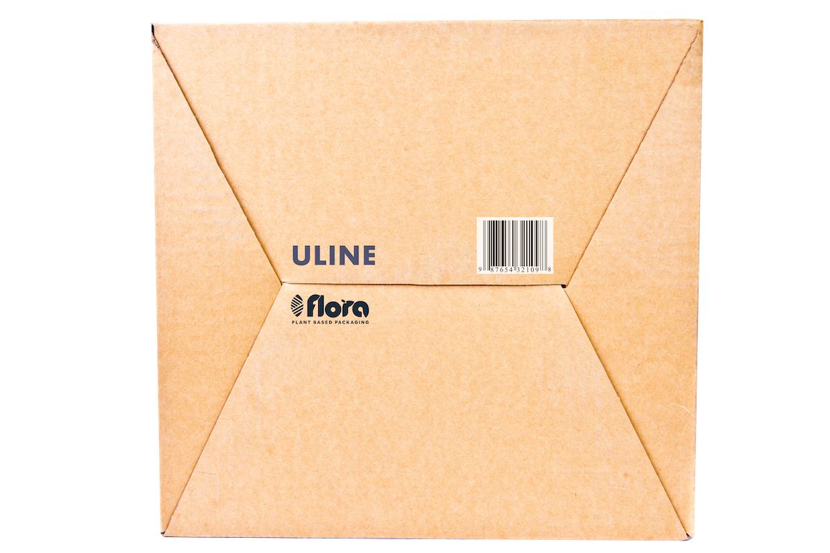
Ad campaigns and Concepts
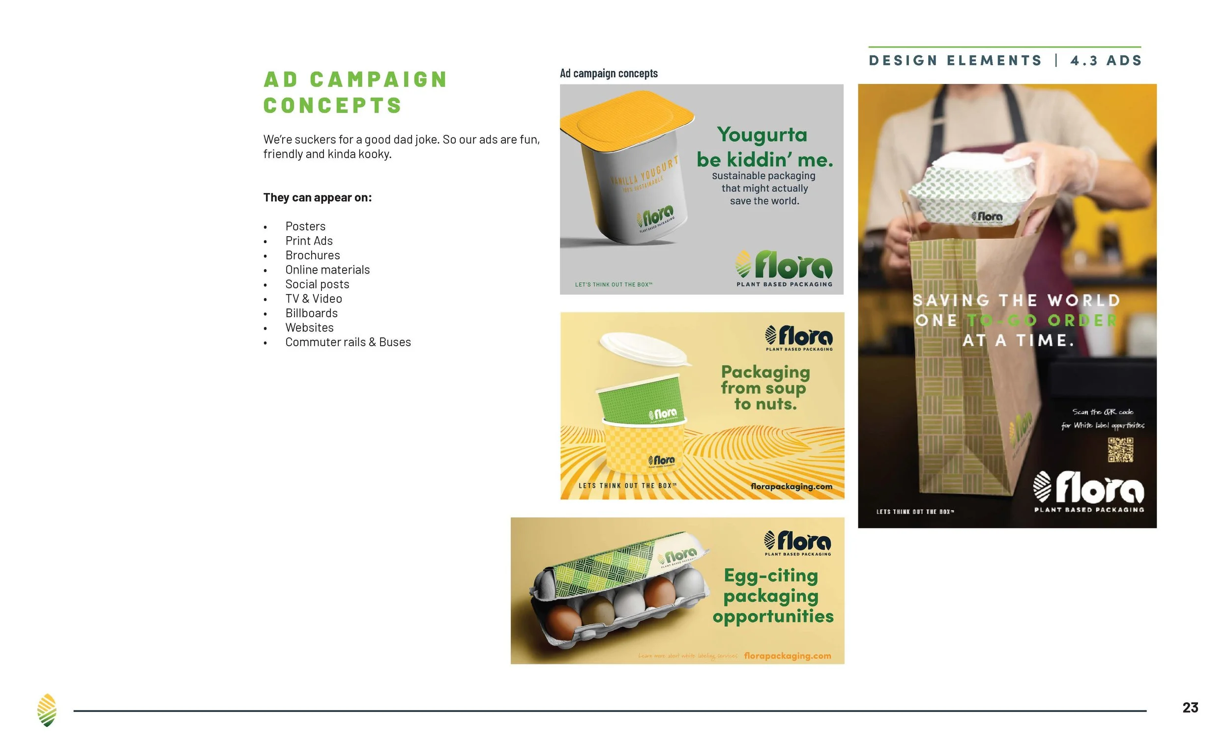
The company philosophy that “We don’t take ourselves too seriously…we sell boxes for godsake.” was taken seriously.
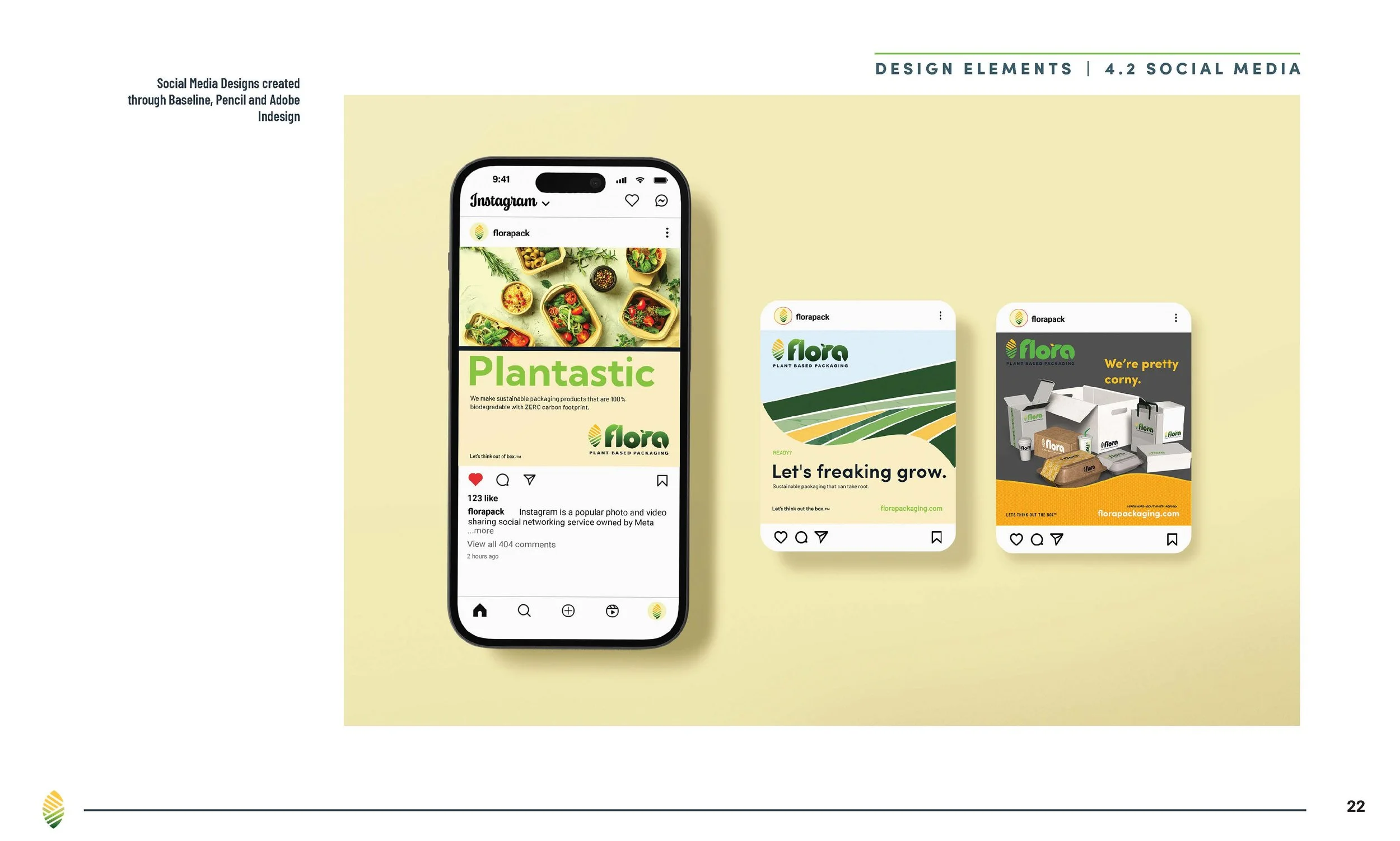
Leaning into that idea, the ad campaigns for Flora are fun, filled with puns, and are meant to be tongue-in-cheek on purpose. The result is a series of clever, fun-to-read ads that can be applied across multiple channels, such as out-of-home, digital, and print.
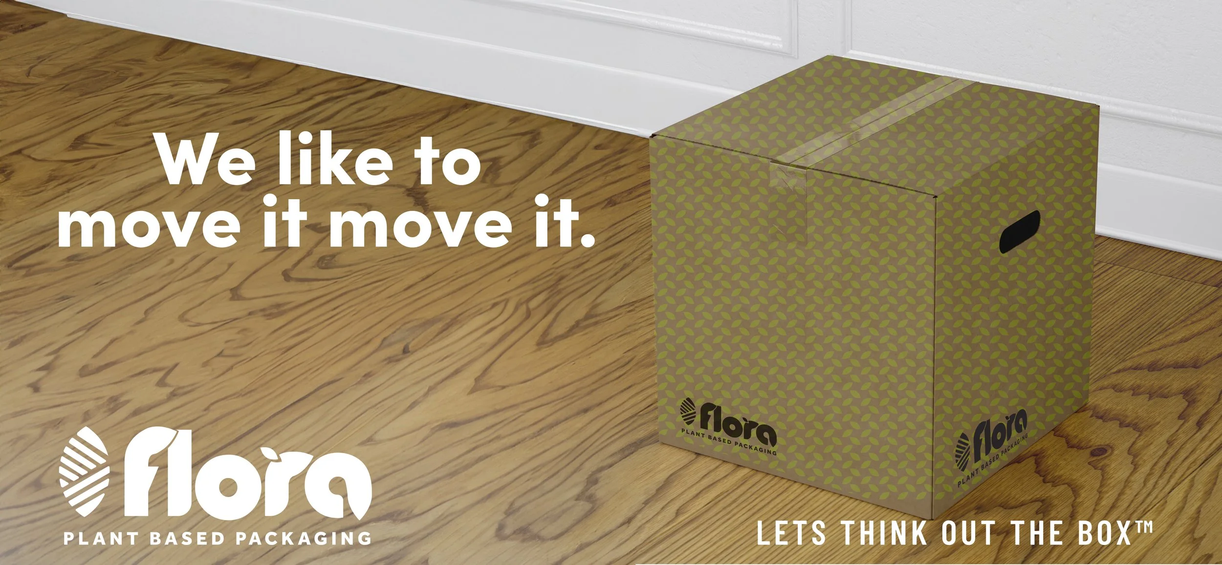
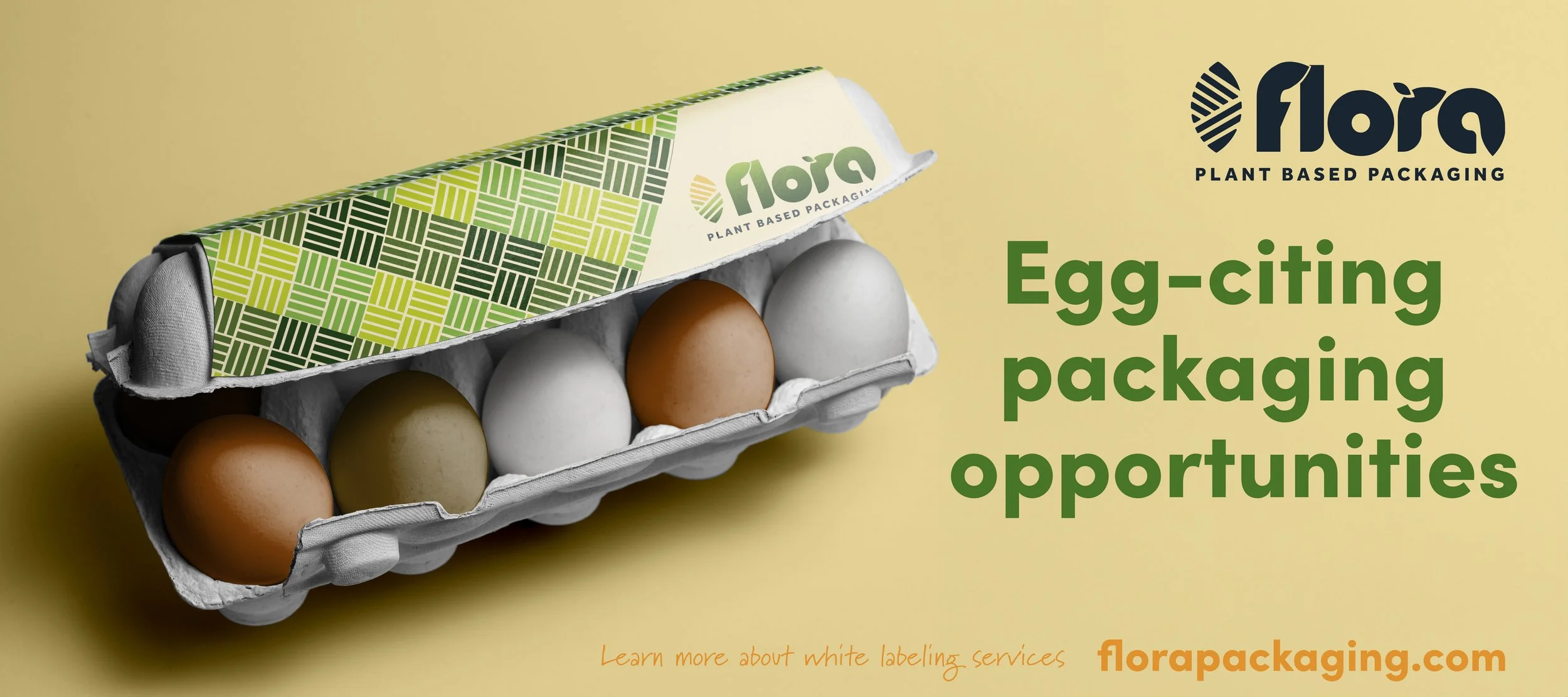
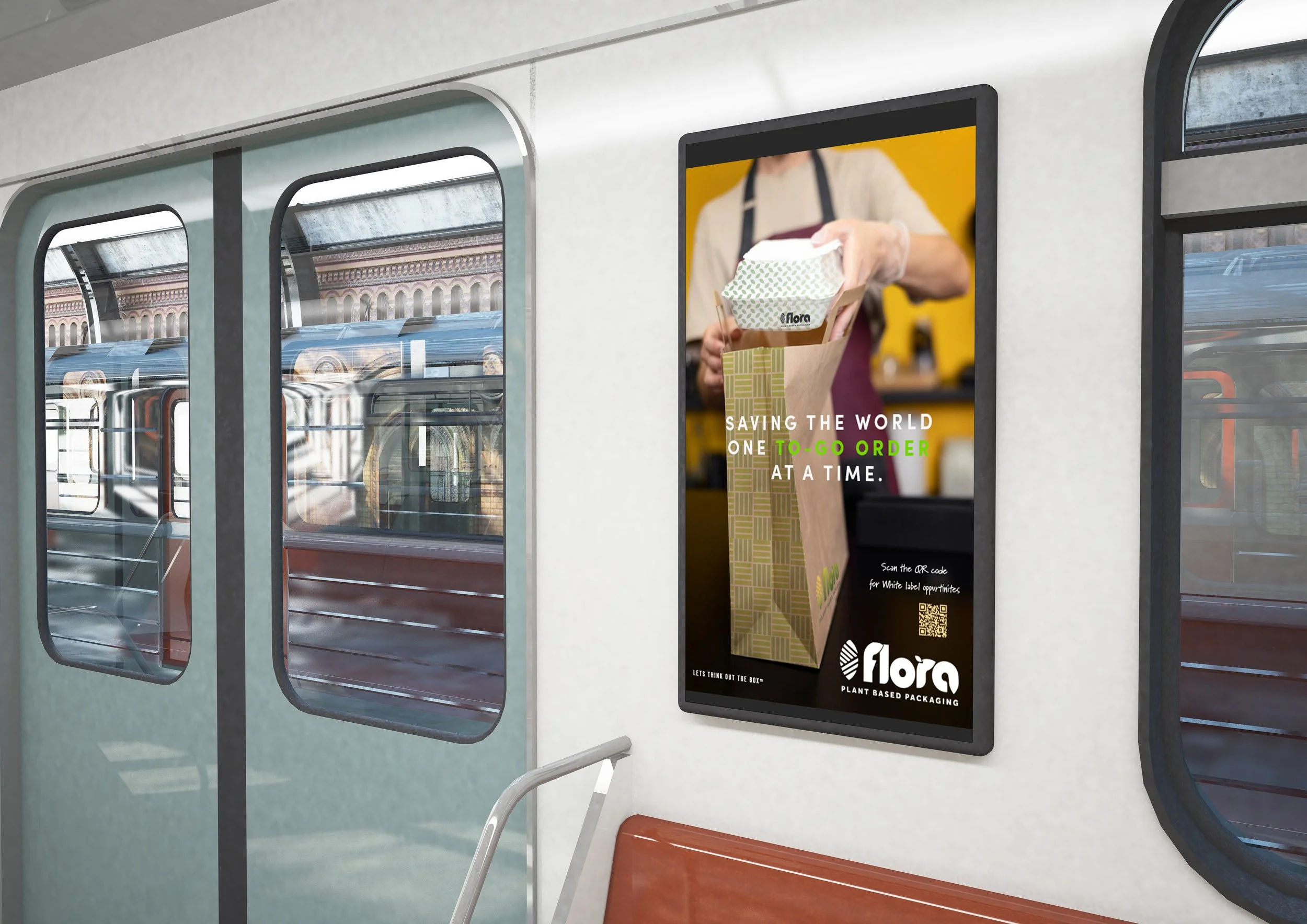
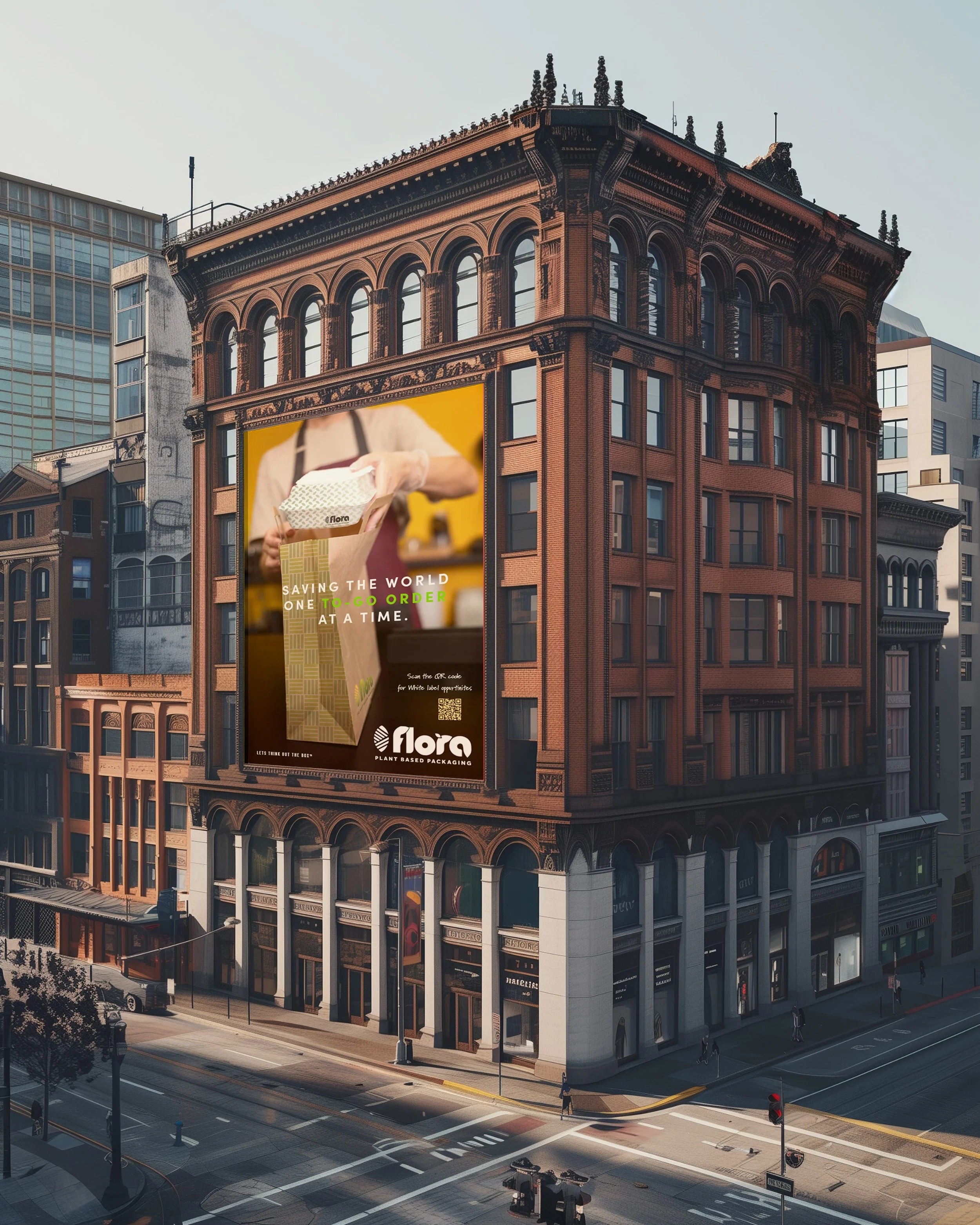
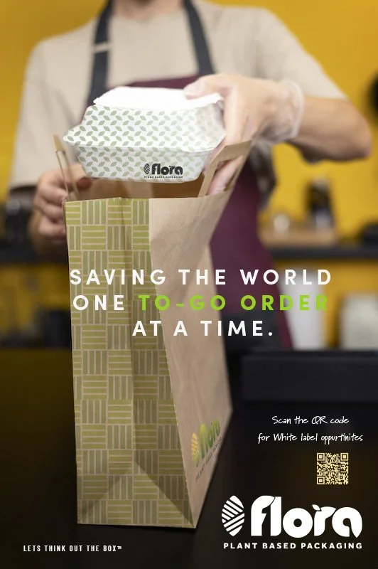
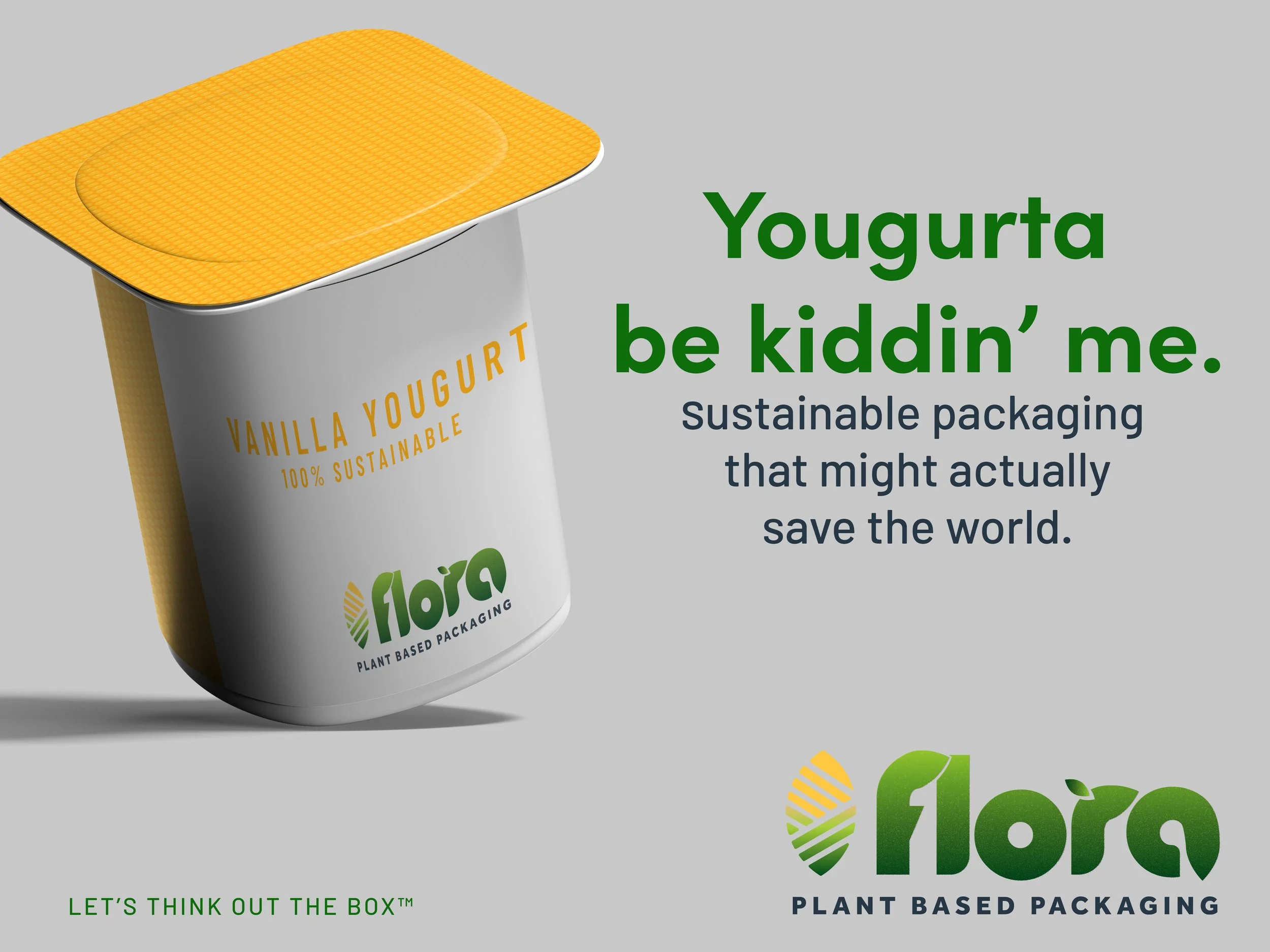
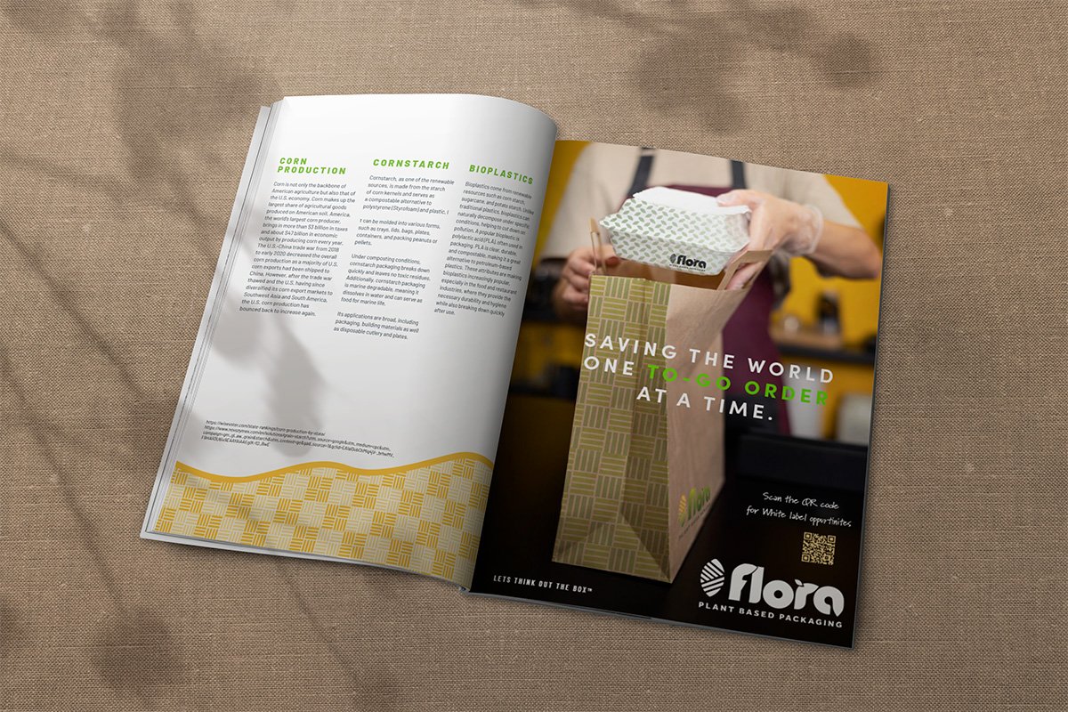
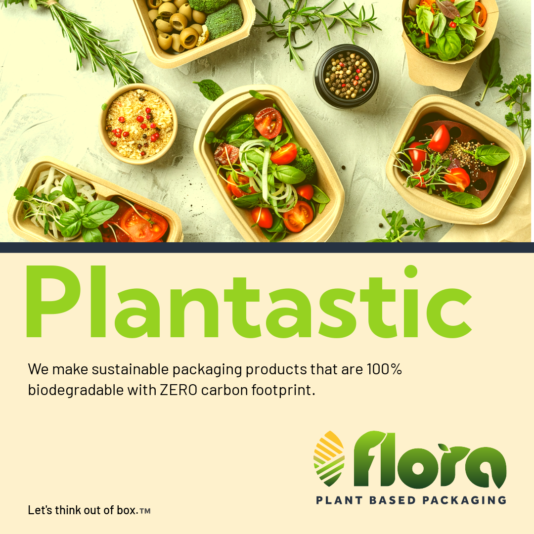
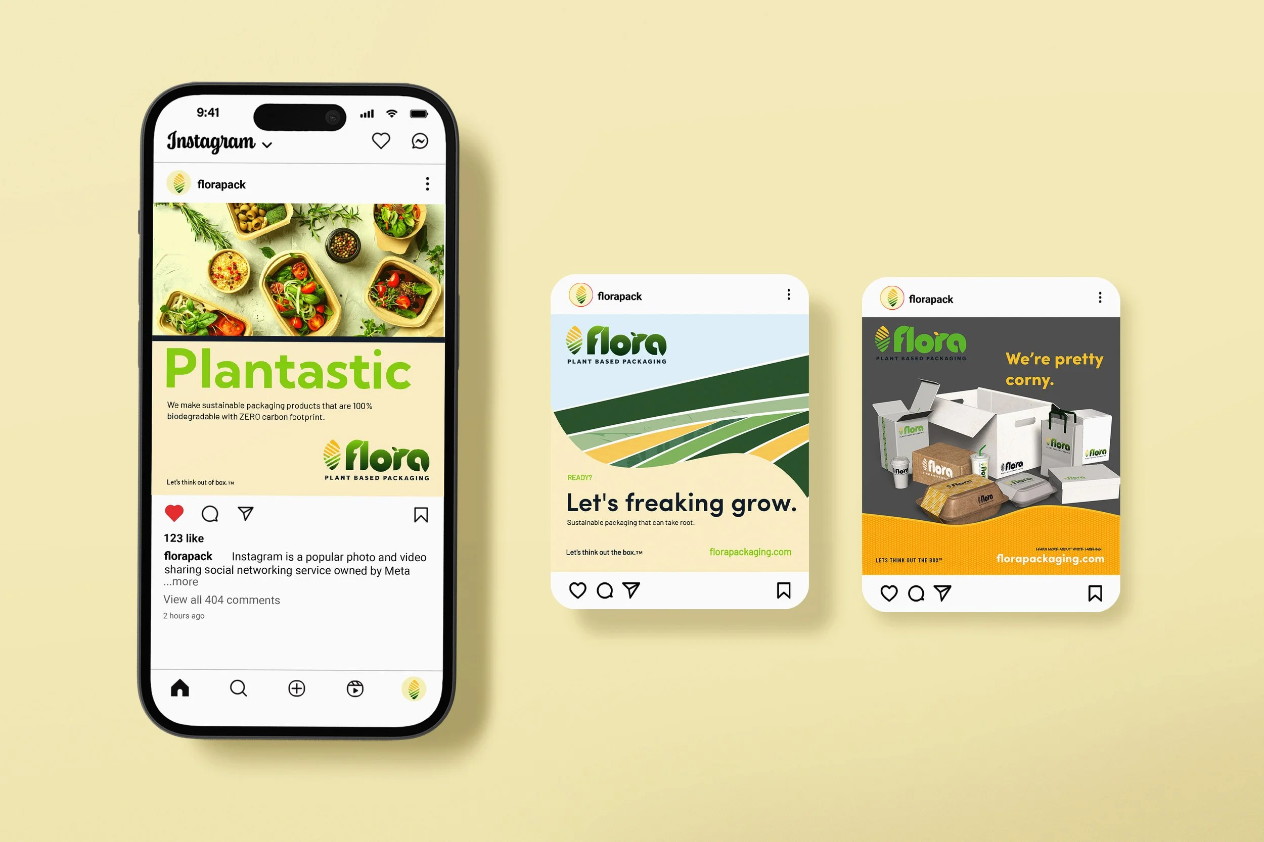
The Flora Packaging brand project and advertising campaign transformed a potentially technical sustainability proposition into a human, memorable, and approachable brand experience.
By pairing environmental innovation with humor and personality, the campaign created a distinctive communications platform capable of extending across traditional, digital, social, video, outdoor, and transit media.
The result was advertising designed not simply to explain sustainable packaging, but to make people want to engage with the brand behind it.
KEY INSIGHTS
Directed end-to-end brand strategy and creative development for an innovative corn-starch packaging company, transforming a complex sustainability proposition into a distinctive, commercially relevant brand platform.
Architected a scalable identity system around a proprietary corn + leaf visual language, developing 3 logo configurations (1-, 2-, and 3-color) and flexible brand standards engineered for print, digital, packaging, and future product applications.
Built the packaging architecture across 10+ packaging formats and product applications, establishing a consistent hierarchy of typography, imagery, color, messaging, and information design while allowing individual products to retain distinct identities.
Expanded the brand beyond its initial packaging proposition by developing a strategic visual system capable of supporting 5+ potential market applications, including shipping materials, ice packs, building materials, and disposable products.
Introduced white-label packaging opportunities, with networking for partnerships across industry leading busineess, positioning the identity system as an adaptable commercial platform capable of supporting third-party adoption and future business models.
Led integrated campaign creative across 3 major channels—OOH, digital, and print—using a distinctive, humor-driven creative platform to translate a technical sustainability proposition into accessible consumer-facing communications.
Established brand governance and creative standards through a comprehensive style guide, creating the structural framework necessary to maintain consistency as the brand expanded across products, channels, and potential markets.
Let’s Connect.
Virtual via Zoom
Meeting ID: 730 665 8768
Passcode: MLLGD
Call
office (914) 920.9828
text (914) 325.1619
Email
info@mllgd.com